
Category: AI Art

  • Character Consistency Prompts for Repeatable AI Image Series

    Character Consistency Prompts for Repeatable AI Image Series

    An AI image series loses credibility when its hero changes eye color, jawline, or wardrobe between scenes. Character consistency prompts give you a repeatable way to hold identity steady while the story, pose, and setting move forward.

    You don’t need every frame to look identical. Diffusion models can reinterpret identity details between scenes, so aim for recognizable visual consistency. You need viewers to recognize a consistent character at a glance, whether they appear in a studio portrait, a rainy street, or a fast-moving video clip.

    Start by separating what must stay fixed from what each new scene can change. The same identity-anchor method can support Kling AI video clips.

    Key Takeaways

    • Build a master character description that separates fixed identity anchors—such as facial structure, hair, eye color, body build, and signature accessories—from scene variables like pose, setting, lighting, and camera angle.
    • Keep the identity clause, prompt order, model version, aspect ratio, style settings, and seed consistent whenever possible. Change one major scene factor at a time so you can identify and correct the source of visual drift.
    • Use character reference images for stronger identity control, and combine tools such as Midjourney Character Reference, IP-Adapter, or ControlNet when text alone is not enough.
    • Repeat the full identity anchor in every image or video prompt, keep video clips focused on one movement, and compare frames at the edit stage to catch continuity problems.
    • Fix facial, clothing, and color drift by preserving successful prompts and settings, then adjusting one control or phrase at a time instead of rewriting the entire prompt.

    Why AI characters drift between generations

    Diffusion models don’t store your character as a permanent person unless a platform provides a reference feature or identity tool that stabilizes character identity. Each generation starts with noise, so identical wording produces related possibilities rather than guaranteed duplicates. This probabilistic process creates visual drift when facial structure, clothing, or proportions change between images.

    Your prompt becomes token embeddings. During generation, cross-attention connects those tokens to visual traits in latent space, such as “copper bob,” “green eyes,” or “mustard jacket.” However, the model may connect a trait to a different facial structure or lighting condition in the next image.

    Lock the conditions before changing the scene

    Lock the prompt structure before changing the scene. Use the same model version, aspect ratio, sampler, style preset, and seed whenever your tool supports those controls. A locked seed gives you a more stable starting point, although it won’t make a prompt portable across different models.

    Keep the identity description in the same order every time. “Short copper bob” and “auburn cropped hair” may sound alike to you, but the model treats them as different instructions.

    Give identity traits more room than scene details

    Place face, hair, body proportions, signature clothing, and accessories near the start of the prompt. Put setting, action, camera, and lighting after them.

    Avoid loading the identity clause with competing style language. If a character has a natural freckled face, asking for hyper-glamorous beauty lighting in one scene and a vintage fashion editorial in the next can push the model toward a new person.

    Build a master character description before prompting

    A master character description is your source of truth. Treat it as the textual character reference stored beside a saved reference image set, seeds, model settings, and successful prompts.

    Record traits that viewers use to recognize the character. Include face shape, skin tone, eye color, eyebrow shape, hairstyle, body build, age range, signature garment, jewelry, scars, and other fine details that remain visible in close-ups and full-body shots.
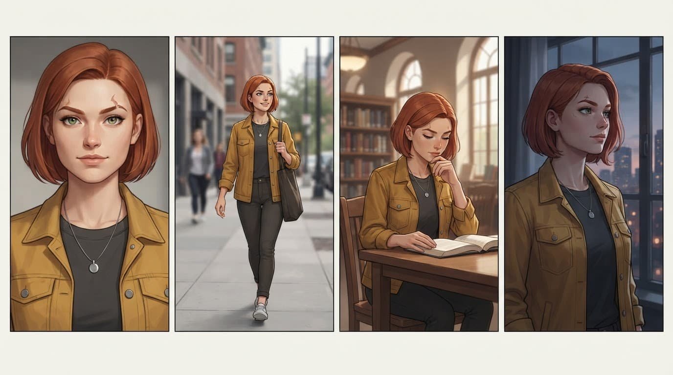
    Four panels show the same woman in a portrait, city street, library, and window-lit scene.

    Separate fixed details from variable scene details

    Use a simple split when writing prompts, since diffusion models benefit from a stable, consistently ordered identity record:

    Keep fixedChange per image
    Facial structure, eye color, hairstyle, buildPose, expression, action
    Signature jacket, pendant, boots, color paletteOutfit layers, weather, location
    Illustration style or photo treatmentLens, framing, time of day, lighting

    This division improves repeatability and prevents a common mistake: rewriting the whole prompt for every shot. You can swap a trench coat for a winter scene, yet retain the same hair, pendant, face, and proportions.

    Start with a character-sheet prompt

    Use this copy-and-adapt character sheet prompt:

    “[Character name], [age range], [face shape], [skin tone], [eye color], [exact hairstyle], [body build], wearing [signature clothing] and [signature accessory], neutral expression, front-facing portrait, clean background, consistent editorial illustration style.”

    Generate a front view, three-quarter view, profile, and full-body image. Save the strongest set. Those four images expose weak details before you invest in a long image series.

    Character consistency prompts that separate identity and scene

    Keep your core prompt unchanged across every scene. This prompt engineering pattern uses a fixed prompt structure: one paragraph, followed by a short scene module.

    For example, a recurring character might begin every prompt with: “Mara Venn, 29-year-old woman, oval face, olive skin with freckles, green almond-shaped eyes, short copper bob with blunt bangs, slim athletic build, mustard field jacket, charcoal crew-neck shirt, silver crescent pendant.”

    After that, add the scene without revising Mara’s description. Prompt chaining carries the same block into successive scene modules.

    • For a recurring environment: “Mara Venn [fixed description], reading a folded map in a quiet railway station, medium shot, morning window light.”
    • For a new pose and outfit: “Mara Venn [fixed description], kneeling beside a motorcycle, dark raincoat over her mustard jacket, low-angle full-body shot, wet pavement at night.”
    • For a close dramatic frame: “Mara Venn [fixed description], looking over her shoulder, close-up portrait, 85mm lens, soft side light, blurred library shelves.”

    Use negative prompts with restraint

    In Stable Diffusion, add negative terms only for repeated failures. If the model keeps adding hats, use “hat” in the negative prompt. If it changes eye color, reinforce the intended color in the positive prompt before adding a long exclusion list.

    Too many exclusions can weaken the image. Track the exact terms used with the successful image, rather than copying a giant generic string into every project.

    What BREAK does in AUTOMATIC1111

    In many workflows, uppercase BREAK moves the text that follows into a new conditioning chunk. This helps because diffusion models may bury important color or clothing language when a long prompt isn’t segmented.

    Put your fixed identity clause first, then use BREAK before the location, action, and lighting details.

    For example: “Mara Venn, green eyes, short copper bob, mustard jacket, silver crescent pendant BREAK rainy train platform, walking pose, wide shot, blue-hour light.” Test this at a fixed seed because model checkpoints and interfaces can handle long prompts differently.

    Use reference images for stronger character identity

    Text-only character descriptions work well for short series. A character reference gives diffusion models a stronger identity signal than text alone, especially when you need many camera angles.

    Choose one clean reference image first. It should show the face clearly, avoid heavy filters, and match the visual medium you plan to use. A portrait from a photorealistic model may not transfer cleanly into a flat illustration workflow.

    Midjourney character reference and character weight

    Midjourney’s Character Reference documentation describes --cref as a way to carry a character into new images. Its --cw setting controls how strongly the reference influences the result.

    Use a higher character weight when hair, clothing, and accessories must stay close to the source. Use a lower character weight when you want a different outfit while keeping the face recognizable. Add your ordinary scene prompt after the reference instruction rather than replacing it.

    The Midjourney web-interface reference options explain how the midjourney web interface separates Character Reference, Style Reference, and Image Prompt. Choose the character option when character identity matters. A style reference may preserve the art style while allowing the person to change.

    ip adapter and ControlNet variants for structural guidance

    The ip adapter uses an image to condition appearance in latent space. It helps carry facial identity, clothing cues, or a distinctive illustration style across images.

    ControlNet variants guide structure rather than identity. OpenPose controls body position, Depth preserves spatial layout, and Lineart follows a drawing’s contours. Pair an identity reference with ControlNet when you need the same person in a new action, such as running, sitting, or turning toward the camera.

    The same approach also applies to Kling AI video workflows. Carry the identity reference into motion while changing the scene.

    Change scenes without making every image repetitive

    A consistent character can change pose, location, and mood without losing recognition. Build variation around a stable identity anchor.

    First, change one major scene factor at a time. Diffusion models handle incremental changes more predictably than several simultaneous changes. Test a new pose while keeping the environment familiar. Then test a new location with the original outfit. This makes it easier to identify what caused drift. Prompt chaining lets each scene build on the last while retaining the identity block.

    Vary camera and lighting with clear language

    Use camera direction that fits the scene: full-body, waist-up, close portrait, overhead view, low angle, or profile. Include one lens cue only when it matters, such as “35mm environmental portrait” or “85mm close-up.”

    Lighting can change the mood without changing the character. “Soft north-window light,” “neon reflections,” and “late-afternoon sun” are scene variables. Keep eye color and hair descriptions intact, because strong color casts often cause the model to reinterpret them.

    When clothing must evolve, describe the relationship. Write “wearing a navy raincoat over the mustard field jacket” instead of replacing the signature jacket without context.

    Carry a static character into AI video

    Carrying a consistent character into motion starts with a strong still in a Kling AI text to video workflow. Video generation adds movement, motion blur, frame transitions, and changing camera distance. Diffusion models can reinterpret identity during a turn, occlusion, fast walk, or changing camera distance.

    Start with a clean still that already matches your target shot and use it as your first character reference. Where supported, the still can also serve as the character reference or opening frame. Kling AI’s Character ID guidance explains how its character-reference tools anchor facial features and proportions across generated clips.
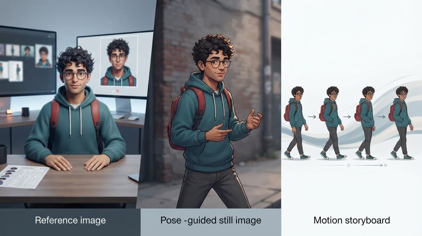
    A man in a teal hoodie works beside a monitor showing character images and a printed sheet.

    Keep video prompts focused on one movement

    Ask for one action per clip: walking forward, turning to camera, lifting a cup, or looking out a window. Long action chains give the model more chances to alter hands, clothes, or facial features.

    Repeat the full identity anchor in every clip prompt, even when you provide an image. Use prompt chaining to link short clips in editing software. Short clips are easier to diagnose than one long generation.

    Check continuity at the edit stage

    After video generation, compare the final frame of one clip with the opening frame of the next. If the jacket changes, regenerate the next Kling AI clip with a reference image from the prior clip’s final frame.

    For group scenes, establish each person in a separate reference image first. Give every character a distinct physical anchor and wardrobe color. Avoid prompts where two people share vague descriptions such as “young woman with dark hair.”

    Fix facial, clothing, and color drift

    When a character changes, you’re seeing visual drift. Don’t rewrite everything. Preserve the successful prompt and settings, isolate one cause, and adjust one control at a time.

    Diffusion models may trade identity for dramatic lighting, a new pose, or color instructions that arrive late. Test one correction before changing the rest.

    ProblemLikely causeFirst correction
    Eye color changesColor appears late or under dramatic lightingMove eye color near the start and repeat it once
    Hair style changesSynonyms or competing outfit languageUse one exact hairstyle phrase in every prompt
    Outfit disappearsReference weight is too low or the scene dominatesRaise reference influence and describe garment layers

    Some controlnet variants can preserve pose or structure while still needing a separate identity reference. Test the relevant control before rewriting the whole prompt.

    Handle aging and major story changes deliberately

    Aging transitions need their own character reference set. Create younger, current, and older versions of the same person. Keep shared anchors, such as eye shape, nose profile, a scar, signature jewelry, and other fine details.

    Don’t ask for “the same character, 30 years older” without visual guidance. Give the model a reference image for each age stage. Update only the traits that should change, such as gray hair, facial lines, or clothing period.

    Use prompt libraries without losing your character file

    A free prompt download can offer ideas, but it can’t replace your master character description. Before downloading AI prompts, check whether each file documents the model version, settings, reference method, and intended visual style.

    A prompt library download or prompt repository is useful when it contains editable examples and supports prompt engineering, rather than anonymous strings. Instant prompt access has little value if you can’t see which variables control pose, lighting, and recurring character details.

    When you get prompt packages, treat each AI art prompt package as raw material. Prompts saved from the midjourney web interface may rely on parameters that fail elsewhere. A Stable Diffusion prompt pack may assume a checkpoint, LoRA, or family of diffusion models you don’t have.

    A ChatGPT prompt collection, text generation prompts, and creative writing prompts can help you develop a character’s biography and scene ideas. However, test specific AI model prompts inside the image generator that will produce your final work.

    Frequently Asked Questions

    What are character consistency prompts?

    Character consistency prompts are repeatable prompt structures that keep a character’s identity stable across multiple images or video clips. They preserve key traits while allowing the pose, setting, lighting, and action to change.

    Which character details should stay fixed?

    Keep the facial structure, eye color, hairstyle, body proportions, signature clothing, accessories, and other recognizable features consistent. Scene details such as pose, expression, location, weather, camera angle, and lighting can change between generations.

    Do character reference images improve consistency?

    Yes. A clean reference image gives the model a stronger identity signal than text alone, especially across different camera angles, poses, and scenes. Use a reference that clearly shows the face and matches the visual medium of the final series.

    How can I fix facial or clothing drift?

    Preserve the successful prompt and generation settings, then adjust one variable at a time. Move important traits near the beginning of the prompt, use one exact description for recurring features, and increase reference influence when the tool supports it.

    How do I maintain character consistency in AI video?

    Start with a clean still that matches the target shot and repeat the full identity anchor in each clip prompt. Keep each clip focused on one movement, then compare the final frame of one clip with the opening frame of the next to catch continuity changes.

    Build recognition, then build the story

    Strong character consistency comes from disciplined repetition, not one magic line, especially when working with diffusion models. Keep the identity anchor stable, store successful references and settings, then vary pose, environment, camera, and light with intent.

    Your series can change mood and location while preserving the face, silhouette, and details that make the character familiar. Visual consistency is the standard that lets Recognition remain intact across every frame.

  • Inpainting Prompts for Precise Object Removal

    Inpainting Prompts for Precise Object Removal

    Object removal can rescue an otherwise usable image when a cable, logo, or passerby distracts from the scene. With inpainting prompts, you can remove that distraction while preserving believable lighting, materials, and geometry.

    The prompt alone won’t carry the edit. Your mask image limits where diffusion models may change pixels, while your words describe the background the model must rebuild. Start by treating the edit as a reconstruction task, not a delete command.

    Key Takeaways

    • Treat object removal as a reconstruction task: the mask defines where pixels may change, while the prompt describes the background that should replace the unwanted object.
    • Mask the full object, including nearby shadows and reflections, with a narrow margin to help the model rebuild edges, texture, and contact details.
    • Keep positive prompts focused on the hidden surface, material, pattern, lighting, perspective, and depth; use targeted negative prompts to discourage visible remnants.
    • Tune mask blur, denoising strength, and guidance scale together, and compare results with a fixed seed before changing multiple settings.
    • Save complete, reusable recipes with the source image, mask, prompts, model, seed, dimensions, settings, and result so successful repairs can be reproduced.

    Start With a Mask That Protects the Scene

    Your mask and prompt work as a pair. During object removal, a careless mask or prompt can make the repaired area look pasted in.

    Mask the object and its immediate evidence

    In most stable diffusion inpainting tools, white areas of the mask are regenerated and black areas remain untouched. The Diffusers inpainting documentation follows that convention. The mask image is the editable input, showing the model where it may redraw the scene.

    Cover the full object, then add a narrow margin to the mask image. This gives the model room to rebuild contact shadows, reflections, occluded grout lines, and nearby background texture. A mask that cuts through a bicycle wheel or a person’s sleeve often leaves a visible edge.

    Include shadows and reflections that belong directly to the object, or the edit may leave a ghost behind.

    Describe the surface behind the object

    Don’t spend your positive prompt describing the object you want gone. Instead, state what should appear in its place.

    Use the prompt to name the material, pattern, direction, lighting, perspective, and depth behind the masked area. If a wall has uneven brickwork, mention the mortar joints. If a person blocks a tiled floor, mention the tile size, grout lines, and camera angle.

    Write Inpainting Prompts That Respect Context

    Good prompts read like concise instructions for rebuilding a small part of a photograph. For object removal, describe the hidden background instead of the object being removed. Diffusion models need visual constraints without reinventing the entire frame.

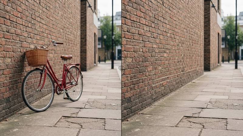
    Split street scene showing a red bicycle beside a wall and the repaired area without it.

    Put the background description first

    For a bicycle beside a wall, use a prompt such as:

    The mask image supplies the spatial boundary, while the prompt describes what should fill it:

    “Continue the weathered red-brick wall and gray concrete sidewalk through the masked area, matching straight mortar joints, low afternoon side light, eye-level perspective, and a faint wall shadow.”

    The clip text encoder interprets concrete terms such as mortar joints, tile size, and camera angle. These details give the repair clearer visual rules.

    This prompt works because it identifies the missing surfaces and their visual rules. It tells the model to continue existing lines instead of adding a generic patch of brick.

    Keep the wider image description short. The surrounding pixels already provide most of the context. Your prompt should focus on the hidden area.

    Use a negative prompt to block remnants

    A negative prompt can use classifier-free guidance to discourage remnants without dictating the whole repair. For the same edit, try:

    “bicycle, wheels, handlebars, person, duplicate object, warped brickwork, text”

    Keep the list targeted. A long list of unrelated defects can pull attention away from the repair. If your tool supports prompt weighting, emphasize only a stubborn issue, such as warped masonry or extra wheels.

    Decide Whether You Need Removal, Replacement, or Restoration

    Each edit needs a different prompt: object removal asks the model to continue the scene, replacement introduces a new subject, and restoration repairs damage while preserving the original image. Context-aware image inpainting uses surrounding pixels and scene structure, so task prompts should target the edit rather than broad image generation. Diffusion models can introduce new pixels for replacements, but restoration should remain conservative.

    Edit goalPositive prompt focusMask approach
    Object removalDescribe the exposed background, texture, and scene continuityCover the object and a thin surrounding ring
    Object replacementDescribe the new subject, placement, and boundaryCover the old item and the intended footprint
    Damage restorationDescribe missing material, texture, and repeating patternCover scratches, tears, or corrupted pixels only

    For object removal, describe the exposed background and its texture so the model continues the scene naturally.

    Treat replacements as new subjects

    With text-guided object inpainting, describe the replacement as a new subject. If its silhouette, footprint, or mounting geometry matters, shape-guided object inpainting can help define those boundaries. If you replace a broken wall lamp, define its size, mounting point, material, light direction, and cast shadow. “Small brass wall sconce centered on the existing mounting plate, warm reflected light on the plaster wall” gives the model a clear job.

    For image restoration, stay closer to the original. A prompt such as “restore continuous oak grain and satin finish, matching the adjacent panel” preserves texture without adding a new design.

    Tune Mask Blur, Strength, and Guidance

    Prompt quality matters, but settings decide how far the model can alter the masked area. Treat them as controls, not universal defaults.

    Blend edges with controlled mask blur

    In AUTOMATIC1111, the edge-softening control blends preserved and regenerated pixels. For a typical web-sized image, set mask blur around 4 to 12 pixels. Increase it as spatial dimensions and resolution rise.

    Too little mask blur can leave a hard cutout edge. Too much allows changes to spill into skin, clothing, or nearby architecture. In AUTOMATIC1111, padding mask crop can also give the model a tighter working crop around the edit.

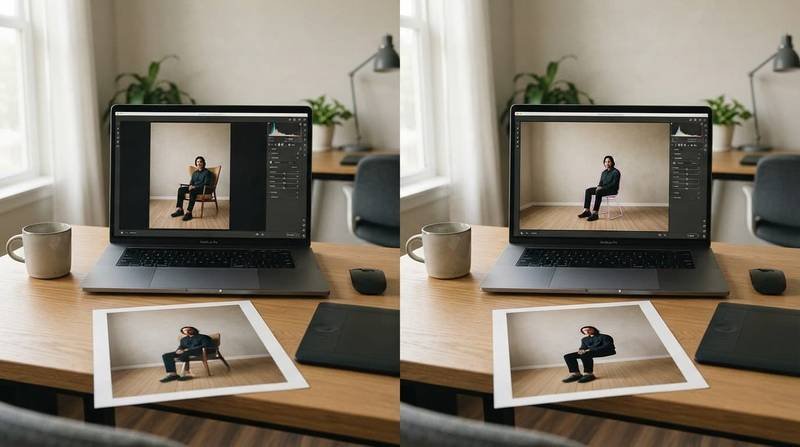
    Laptop and printed photos show a chair removed from a studio image.

    Balance denoising strength and guidance scale

    In stable diffusion inpainting, denoising strength determines how much source information survives the denoising process. For ordinary object removal, start near 0.35 to 0.55.

    Raise it when the hidden background needs major reconstruction. This can help when object removal covers complex texture, but expect more variation in texture and edges.

    A guidance scale around 4 to 7 is a practical starting range. It controls classifier-free guidance, which pushes the result toward the prompt.

    At a higher guidance scale, classifier-free guidance can overconstrain the edit, creating brittle surfaces or repeated detail. Prompt weighting can make a small emphasis adjustment, but it won’t replace a better mask.

    The masked-content choice also changes how the mask image initializes the edit. Original can preserve nearby visual information, but it may retain traces of the removed item. Fill gives the model a neutral starting area. Latent noise encourages a fuller rebuild and suits large replacements, although it increases the risk of mismatched lighting.

    After a high-resolution upscale, use ControlNet Tile Resample to restore local material detail. Choose upscaler models according to local texture, using smoother models for skin and sharper models for architecture.

    Keep denoising low when testing upscaler models, then inspect edges for halos or invented detail. Some upscaler models can exaggerate boundaries, so return to the mask if the repair starts to look artificial.

    Use the original image as the conditioning image for this workflow. The ControlNet Tile Resample guide explains why it is often paired with an upscaler. This step restores detail, but it can’t correct a poorly masked edit.

    Pick a Model and Workflow That Match the Edit

    A general text-to-image checkpoint can inpaint, yet an inpaint-specific checkpoint usually produces cleaner transitions. A Stable Diffusion inpainting workflow preserves source context better than a standard text-to-image pipeline, which may invent surrounding pixels during image generation.

    Technical note: diffusion models often use a latent diffusion model for this task. It denoises latent representations, while its unet network predicts each update and the clip text encoder supplies text conditioning.

    Configure a Hugging Face Diffusers pipeline

    For Python, use hugging face diffusers and load an inpaint-compatible checkpoint with AutoPipelineForInpainting. Pass the source as image, using it as the conditioning image, and pass the binary mask as mask_image.

    Confirm that this mask image matches the source dimensions. In the generation call, provide prompt, negative_prompt, strength, and guidance_scale.

    The guidance_scale value controls classifier-free guidance, balancing prompt influence against image context. Higher strength allows more of the denoising process to rewrite masked pixels.

    Before generation, validate the mask image’s alignment with the intended edit region. If you use automatic1111, check whether prompt weighting is enabled, and consider Kandinsky inpainting when its checkpoint matches your workflow.

    Use a fixed seed while testing. That lets you compare one adjustment at a time instead of chasing random differences. The Stable Diffusion inpainting pipeline reference documents this inpaint-compatible pipeline and lists its supported inputs and controls.

    If edits follow the prompt too aggressively, lower guidance_scale; excessive classifier-free guidance can overpower local context.

    Use task-aware tools for harder repairs

    PowerPaint separates text-guided object inpainting from context-aware image inpainting through learned task prompts named Pobj and Pctxt.

    In a compact comparison, PowerPaint uses Pobj for text-guided object inpainting when adding or replacing a subject. Pctxt supports context-aware image inpainting when rebuilding a scene after object removal.

    The official project page explains how PowerPaint’s learned task prompts and training strategies give the two controls different behavior.

    For ordinary object removal, let the mask and surrounding image carry most of the instruction. For a replacement, shape-guided object inpainting helps preserve silhouette and placement while the prompt describes the new subject.

    If a repair looks soft, inspect it at native resolution before using upscaler models. Upscaler models can sharpen edges, but they shouldn’t hide a mask or texture mismatch.

    Build a Prompt Library You Can Reuse

    Save successful edits as reproducible recipes, not isolated lines of text. A useful library records the positive prompt, negative prompt, model, seed, dimensions, denoising strength, guidance scale, mask notes, upscaler models, and a result thumbnail.

    Tag each recipe by edit type, such as text-guided object inpainting, context-aware image inpainting, object removal, or image restoration.

    Store context with every prompt

    When you save prompts or recipe files, keep the source image, mask image, and task prompts with the settings. Record the seed, workflow, output dimensions, and model-specific controls beside them.

    For example, note automatic1111, PowerPaint, or Hugging Face Diffusers in the workflow field. Save task prompts when the workflow uses them.

    Also record the relevant CLIP text encoder version, classifier-free guidance setting, and documented training strategies. Checkpoint family matters because diffusion models can interpret the same description differently.

    Judge prompt packages by their edit data

    Judge prompt packages by their edit data, not by prompt length. A reliable object removal recipe includes the source image, mask, seed, settings, and before-and-after result.

    Compare source and repaired outputs at native size first. If enlargement matters, test the same upscaler models and save the comparison.

    Frequently Asked Questions

    What should an inpainting prompt say when removing an object?

    Describe the background that should appear after the object is gone rather than repeating details about the unwanted object. Include relevant materials, patterns, lighting, perspective, and depth so the model can continue the surrounding scene.

    How much of the image should the mask cover?

    Cover the entire object and include a narrow surrounding margin. Include shadows, reflections, and other evidence that belongs to the object, but avoid extending so far that nearby skin, clothing, or architecture is unnecessarily regenerated.

    What denoising strength is a good starting point for object removal?

    For ordinary object removal, start around 0.35 to 0.55 and adjust based on the complexity of the hidden background. Raise it when the area needs major reconstruction, but expect more variation in texture and edges.

    Should I use a negative prompt for object removal?

    A targeted negative prompt can discourage remnants such as wheels, text, duplicate objects, or warped brickwork. Keep the list short, because unrelated terms may distract the model from rebuilding the masked area.

    How can I make an inpainted repair look native to the image?

    Start with a precise mask, a background-focused prompt, and settings that preserve nearby pixels. Inspect the result at native resolution, check for mismatched lighting or hard edges, and only then consider using upscaler models to restore local detail.

    Make Each Repair Look Native to the Image

    Precise object removal starts with a narrow mask, a background-focused prompt, and settings that protect nearby pixels. When a repair fails, check the mask boundary, background continuity, and settings before rewriting everything.

    The strongest inpainting prompts describe the scene that should remain after the unwanted object disappears. This simple principle helps the final object removal look native to the original frame.

  • Negative Prompts for AI Images With Cleaner Results

    Negative Prompts for AI Images With Cleaner Results

    A strong image prompt can still produce a face with odd eyes, unwanted text, extra fingers, or a background that fights your subject. Negative prompts AI images give you another control point during AI image generation: a way to tell a model which traits, objects, and visual defects should stay out of the frame.

    You won’t get a perfect result by pasting a giant blacklist into every generation. Cleaner output comes from pairing a clear positive prompt with short exclusions that match the failure you can see. Start with the image you want, then remove only what interferes with it.

    Key Takeaways

    • Negative prompts steer an image model away from unwanted concepts, but they are not absolute bans.
    • Your positive prompt defines the subject and composition. Negative terms remove distractions, artifacts, and conflicting styles.
    • Stable Diffusion supports a dedicated negative prompt field, while Midjourney uses the --no parameter.
    • Short, focused exclusions work better than long strings of generic quality complaints.
    • Change one variable at a time so you can see which term improves or harms the image.

    How Negative Prompts AI Images Make Cleaner

    A negative prompt is an exclusion instruction. It tells the model to reduce the chance of visual elements you don’t want, such as a watermark, distorted hands, a crowded scene, or a cartoon style.

    Your main prompt still has the larger job. If you write editorial portrait of a founder in a sunlit office, you describe the intended image. Adding blurry, text, watermark, extra fingers to a negative field asks the model to avoid common distractions.

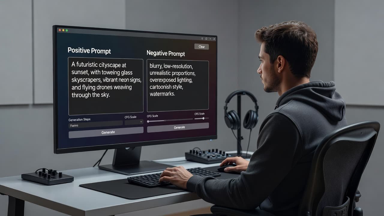
    A person working at a clean desk with a computer monitor showing creative software.

    In Stable Diffusion interfaces, the negative text replaces the empty unconditional conditioning used during the diffusion process. That gives the model a direction to move away from as it forms the image. The Stable Diffusion Art explanation of negative prompts shows why exclusions influence generation rather than delete pixels after the fact.

    That difference matters. A negative instruction cannot reliably repair a weak positive prompt or save overall image quality. If you ask for a “woman holding a product” without describing the pose, camera distance, product shape, or setting, the model still has too much freedom. Adding bad anatomy or bad hands may reduce defects, yet it won’t create a convincing product photograph on its own.

    A negative prompt works best when it removes a known failure from an otherwise clear creative direction.

    Treat it as a guardrail, not a substitute for art direction. First describe the subject, setting, visual medium, lighting, and composition. Then add exclusions that protect those choices.

    Build Negative Prompts Around Visible Failures

    Start each test with a narrow set of terms. Generic lists copied from a prompt repository often include dozens of words that don’t fit your model or scene. Some terms can even push the image toward strange crops, simplified details, or empty backgrounds.

    Match the negative prompt to the error category you need to control:

    • For portrait artifacts, try extra fingers, extra limbs, deformed face, crossed eyes, disfigured.
    • For marketing visuals, use text, watermark, logo, signature, border when you need clean space for your own copy.
    • For a realistic style, exclude cartoon, illustration, CGI, plastic skin, skin texture if the model keeps drifting away from photorealistic results or realistic images.
    • For composition issues, test cropped head, out of frame, duplicate subject, cluttered background.
    • For product images, add terms such as distorted packaging, warped label, floating object, jpeg artifacts only after you see quality artifacts or other problems in your outputs.

    For example, a creator making a website header might use:

    modern ceramic coffee mug on pale stone counter, soft window light, editorial product photograph

    Then add:

    text, watermark, logo, extra objects, distorted mug handle

    This works because each negative term connects to a realistic risk. The positive prompt fixes the subject and style. The exclusions preserve a clean commercial frame.

    Avoid contradictory language. A prompt that requests “dramatic motion blur” but excludes blurry sends mixed signals. Similarly, asking for a dense city market while blocking people, crowd, stalls, signs leaves little material for the model to use.

    You should also separate quality faults from personal preferences. Low resolution and blurry target output quality. Blue or trees are content exclusions. When a result feels wrong, identify which category failed before adding more terms.

    The practical guide to negative prompting offers useful examples across Stable Diffusion, Midjourney, and Leonardo. Still, your own test images should decide which terms remain in your template.

    Midjourney, Stable Diffusion, and Positive Alternatives

    Each platform interprets exclusions differently. You need specific AI model prompts, not one universal negative string pasted everywhere.

    Stable Diffusion tools, such as the AUTOMATIC1111 interface, usually give you a separate negative prompt field. A short baseline such as low quality, blurry, watermark, signature can help for general content, although many SDXL checkpoints respond differently. A photorealistic model may benefit from anatomy terms, while an anime checkpoint may already have strong style defaults.

    A useful Stable Diffusion test pair looks like this:

    positive prompt: business owner seated at a walnut desk, natural window light, documentary photography

    negative: extra fingers, distorted hands, text, watermark, duplicate person

    Generate several images with the same seed if your tool allows it. Then remove or add one exclusion. That controlled comparison shows whether duplicate person solved a real issue or accidentally reduced scene detail.

    Midjourney handles exclusions through --no. Its official documentation says each word in the parameter is read independently, so keep it brief. You might write:

    minimal skincare bottle on white pedestal, soft shadows --no text watermark hands

    The --no parameter documentation also advises describing what you want when exclusion is unreliable. If Midjourney keeps adding a busy backdrop, write isolated product on an empty white studio background before expanding the --no list.

    Some models respond better to positive constraints. Rather than writing --no crowd, cars, signs, clutter, describe one person on an empty beach at sunrise. Positive wording supplies clear visual material. Negative wording only tells the model which associations to reduce.

    This is especially true for difficult concepts. Excluding shoes may produce bare feet, hidden feet, or a crop above the ankles. If footwear matters, state the desired result: wearing black leather boots, full body, feet visible. Use exclusions only for failures that continue after the positive prompt is clear.

    A Simple Workflow for Refining Exclusions

    When an image misses the mark, don’t rewrite every prompt line. Follow a repeatable sequence:

    1. Save the best current prompt and settings, including model, seed, aspect ratio, steps, CFG scale, and stylization values.
    2. Name the one largest flaw in plain language, such as “unwanted text” or “two faces.”
    3. Add one to three relevant negative terms, then generate another batch with all other settings unchanged.
    4. Compare outputs at full size. Keep terms that fix the flaw without weakening the subject.
    5. Move proven exclusions into a small template for that model and image type.

    Image-generation settings are separate controls. Higher resolution may improve detail, but it won’t remove a watermark. A different aspect ratio can prevent a cropped subject, while it won’t solve deformed hands. Sampling steps, seed, model checkpoint, denoise strength, and guidance scale also change the result. Diagnose the failure before blaming the negative prompt, and keep in mind that careful refinement during AI image generation ensures your overall image quality improves without relying on bloated default lists.

    Save working templates in a searchable prompt repository. You might offer a prompt download free sample for new subscribers, then let readers download AI prompts organized by tool and use case. A prompt library download is more useful when each file records the model, version, settings, positive text, negative text, and a thumbnail of the result.

    For example, a Midjourney prompt download should include --no syntax, while a Stable Diffusion prompt pack should identify the checkpoint and sampler. An AI art prompt package can include image prompts, but it should not pretend that a ChatGPT prompt collection, text generation prompts, or creative writing prompts will transfer directly to a visual model.

    If you sell templates, make instant prompt access practical rather than vague. Let buyers get prompt packages in labeled folders, with prompt files available for download and clear notes on which tools they suit. A reliable prompt repository saves your audience from testing an exclusion list built for the wrong model.

    Frequently Asked Questions

    What is a negative prompt in AI image generation?

    A negative prompt is an exclusion instruction that tells the model which traits, objects, and visual defects you want to avoid in the final output. It acts as a guardrail to steer the AI away from common errors like distorted hands, watermarks, or unwanted text.

    How do negative prompts differ between Stable Diffusion and Midjourney?

    Stable Diffusion usually utilizes a dedicated negative prompt text field where you can paste lists of exclusions. Midjourney handles exclusions through the --no parameter appended to your prompt, which works best when kept brief.

    Are long lists of negative terms better for image quality?

    No, short and focused exclusions work much better than long strings of generic complaints. Copying massive blacklists from prompt repositories can cause strange crops, simplified details, or unintended style shifts.

    Cleaner Images Start With Clear Direction

    Negative prompts remove friction when they target a visible problem. They work best beside a detailed positive prompt and stable generation settings, not as a long list of borrowed terms.

    Keep your exclusions short, test them one at a time, and save only the combinations that improve your own outputs. Cleaner AI images come from precise direction, careful comparison, and well-crafted negative prompts that give the model enough good information to follow during AI image generation.

  • Top 10 MidJourney Image Styles to Try First

    Top 10 MidJourney Image Styles to Try First

    MidJourney can turn one simple prompt into a velvet-soft painting, a comic-book blast of color, or a broken screen full of static. That jump in look is why image style matters so much.

    If your results feel flat, the problem often isn’t the subject. It’s the visual language wrapped around it. These 10 MidJourney styles keep showing up because they’re clear, dramatic, and easy to guide with a few strong words.

    What makes a MidJourney image style stand out?

    A style changes more than surface detail. It changes texture, color, rhythm, and mood, all at once. In MidJourney, that means the same portrait can feel elegant, chaotic, nostalgic, or eerie, depending on the style words you choose.

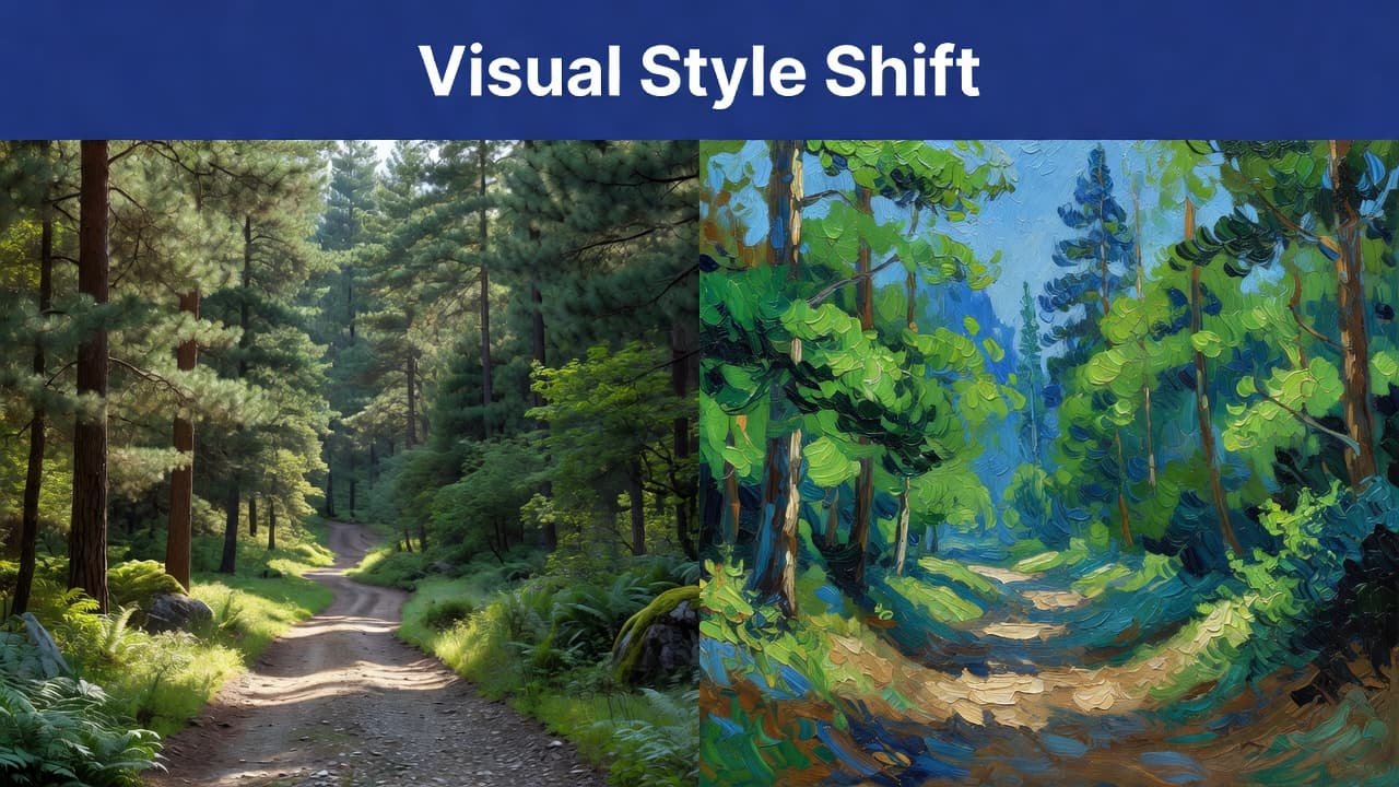
    A forest scene is divided vertically between a sharp photographic image and a textured oil painting. A bold indigo bar spans the top with white sans-serif text titled Visual Style Shift.

    ### Style, subject, and mood are not the same thing

    The subject is what the image shows. A portrait, a skyline, or a fox in snow are subjects. Style is how that subject looks, whether it’s Cubist, Pop Art, or Gouache. Mood is the feeling it gives off, such as calm, electric, or unsettling.

    That difference matters because MidJourney reads all three. “A portrait” is only a starting point. “A portrait in Pop Art with hot pink shadows and upbeat mood” points the model toward something far more distinct.

    Why some styles work better than others in MidJourney

    The strongest styles are easy to recognize at a glance. They have bold features, clear color behavior, and textures MidJourney can echo well. That’s why Pointillism, Impressionism, and Glitch Art keep appearing in prompt communities and shared examples, including these community style examples.

    Also, some styles fit certain subjects better. Cubism loves faces and architecture. Impressionism flatters gardens and street scenes. Meanwhile, Glitch Art shines when you want tech-heavy tension instead of natural beauty.

    The 10 image styles people keep coming back to in MidJourney

    Some 2026 trends lean toward hybrid hand-painted work, psychedelic neon, and gritty neo-brutalist edges. Still, these 10 styles stay popular because they produce memorable results fast and give prompts a clear visual spine.

    Pointillism for images that feel made of tiny dots

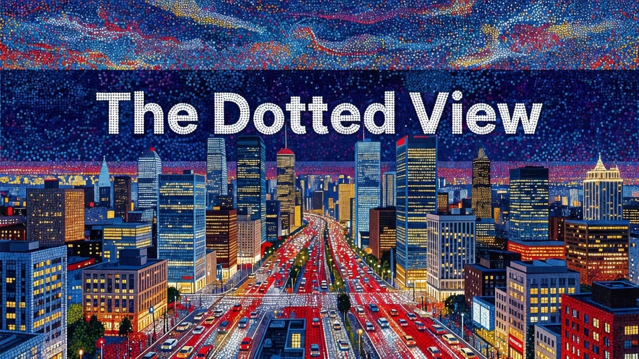
    Pointillism looks hand-built, almost patient. Up close, it seems scattered into dots. From a distance, those dots melt into glowing color. It works best for cityscapes, bright birds, flower fields, and portraits that need a painterly pulse.

    An intricate city landscape constructed from thousands of tiny, colorful dots using pointillism techniques. A bold indigo band stretches across the top, featuring the clean sans-serif headline The Dotted View.

    ### Cubism for bold shapes and fractured faces

    Cubism breaks a scene into sharp planes and tilted geometry. Faces look split and reassembled. Tables, windows, and buildings become stacks of angles. Use it for portraits, still life, and interiors when you want tension, structure, and visual bite.

    Pop Art for loud color and comic-book energy

    Pop Art is blunt in the best way. It uses flat color, thick contrast, halftone dots, and poster-like confidence. MidJourney handles it well for celebrity portraits, fashion images, product ads, and graphics that need to stop the scroll.

    Psychedelic for swirling color and dreamlike motion

    Psychedelic style twists the frame into a visual current. Shapes ripple, colors pulse, and edges feel slightly alive. It suits fantasy forests, music posters, cosmic scenes, and surreal portraits. In 2026, psychedelic neon remains one of the most reused looks across AI art communities.

    Impressionism for soft brushstrokes and glowing light

    Impressionism cares more about atmosphere than razor detail. Light blooms across the scene, edges soften, and color blends like wet paint. Use it for gardens, rainy streets, sunsets, and quiet portraits where you want warmth instead of sharp precision.

    Fauvism for wild color that bends reality

    Fauvism throws realism out the window and keeps emotion. Trees can glow orange, skin can turn teal, and shadows can hum with violet. Because the brushwork stays visible, MidJourney images feel expressive rather than polished. Landscapes and animal art often look fantastic in this style.

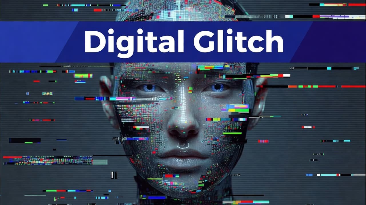
    Glitch Art for a digital, broken-screen look

    Glitch Art introduces failure on purpose. You get pixel drift, RGB splits, scan errors, and visual noise that feels electronic and unstable. It fits cyberpunk scenes, futuristic portraits, album covers, and brand visuals that want an edgy tech mood.

    A striking human portrait features intense pixelated noise and vibrant horizontal color shifts across the face. A bold indigo band sits at the top with sans-serif text reading Digital Glitch.

    ### 80s VHS Color Glitch for retro video nostalgia

    This version of glitch art feels older and warmer. Tape noise, color bleed, scan lines, and blown-out magentas create that late-night TV mood. It’s a natural fit for synthwave scenes, retro portraits, arcade posters, and nostalgic music artwork.

    Deformed Troxler Effect for warped, unsettling visuals

    This style pulls from optical distortion. Faces blur at the edges, features stretch, and objects seem to drift as if your eyes can’t lock onto them. Because it feels eerie, it works best for experimental portraits, horror art, and strange editorial concepts.

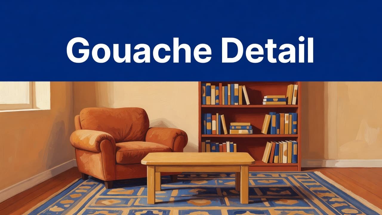
    Modern Gouache Texture for soft, rich, painted detail

    Modern gouache has matte depth and thick painted warmth. MidJourney often renders it with soft edges, layered brush texture, and cozy color. That makes it great for storybook scenes, editorial spots, food art, children’s themes, and gentle home interiors.

    A rich, hand-painted gouache surface features a deep indigo geometric band along the top edge. The textured background showcases soft matte brushstrokes with clean, minimalist production styling throughout the composition.

    ## How to write better MidJourney prompts for each style

    A strong style word helps, but it won’t carry the whole image alone. MidJourney responds better when you pair style with a clear subject, color direction, and texture cue.

    Use subject, color, and texture together

    A style name works best when it has something concrete to grab onto. “Pointillism” is okay. “Pointillist blue jay on a fence, jewel-tone dots, spring light” is far better.

    Try prompts like “cubist jazz singer, fractured planes, smoky brown palette”; “pop art perfume bottle, halftone texture, yellow and red”; “modern gouache breakfast table, matte paint, warm morning light”; and “fauvist tiger in tall grass, electric orange and teal.”

    One clear style word beats five vague adjectives.

    Keep prompts short enough to stay focused

    Too many details blur the result. MidJourney often gives cleaner images when the prompt stays tight and visual. As of 2026, MidJourney V8.1 also gives stronger direct control through Raw mode, so “–style raw” can help when the model keeps drifting into its default polish.

    Try “glitch art portrait, RGB shift, black background, –style raw”; “impressionist harbor at sunrise, soft brushwork, pale gold”; “psychedelic desert poster, swirling sky, neon shadows”; and “80s VHS glitch dancer, scan lines, magenta bleed.” If you want repeatable style control, Midlibrary’s style reference library is useful for checking SREF options and examples.

    Match the style to the scene you want

    The smartest prompt is not the longest one. It’s the one that matches the job. Pop Art fits social graphics because it reads fast. Impressionism fits beauty and travel scenes because it softens everything. Glitch Art fits tech branding because the distortion feels intentional.

    Use prompts such as “pointillist Paris street after rain, colorful dots”; “deformed Troxler face, blurred features, eerie studio light”; “pop art sneaker ad, flat shadows, cyan and orange”; and “modern gouache children’s bedroom, cozy lamps, muted coral.” You can see more variations in this MidJourney style roundup, then trim the ideas down into your own shorter prompt.

    Which style should you try first?

    Start with your goal, not your favorite art movement. A good style choice makes the image feel right before you even notice the subject.

    Best styles for portraits and faces

    Pop Art gives faces instant personality and graphic punch. Cubism adds structure and tension. Glitch Art makes portraits feel synthetic or futuristic. Deformed Troxler Effect pushes faces into eerie, unstable territory, which works best for experimental work.

    Best styles for landscapes and scenery

    Impressionism is the gentlest pick for scenery because light carries the image. Fauvism adds emotional color fast. Pointillism makes wide scenes shimmer, while Psychedelic style turns forests, deserts, and skies into moving dreamspaces.

    Best styles for social content and branding

    Pop Art grabs attention in thumbnails and banners because contrast stays loud even at small sizes. VHS Color Glitch gives retro identity to posters and album covers. Modern gouache adds warmth for editorial posts, product stories, and cozy lifestyle branding.

    Final thoughts

    The best MidJourney style is the one that matches the feeling you want on the screen. A fox can look tender in gouache, electric in Pop Art, or haunted in Glitch Art, all from the same basic idea.

    These 10 styles give you a strong place to start. Try the same subject in three different looks, compare the mood, and build your own visual voice one prompt at a time.

    FAQ

    Does MidJourney understand art movement names well?

    Yes, usually. Well-known style names like Impressionism, Cubism, and Pop Art are easy for MidJourney to interpret because they have strong visual traits.

    Should you use artist names or style names?

    Style names are the safer starting point. They keep the prompt clear, and they avoid overloading the image with too many mixed signals.

    What’s the difference between Glitch Art and VHS Color Glitch?

    Glitch Art feels digital and sharp, with pixel shifts and broken-screen energy. VHS Color Glitch feels analog and nostalgic, with tape noise, scan lines, and color bleed.

    Can you combine two styles in one prompt?

    Yes, but keep the mix controlled. “Pop Art portrait with glitch accents” usually works better than stacking four or five styles into one sentence.

  • Stop Writing Syntax: The Founder’s Blueprint for 10x Vibe Coding

    Stop Writing Syntax: The Founder’s Blueprint for 10x Vibe Coding

    The Founder’s Guide to Vibe Coding: Building Full-Stack Apps with Natural Language

    For a couple of decades, the barrier to entry for building software was steep. If you had a million-dollar idea but couldn’t write code, you faced a dilemma: spend months learning Python or JavaScript, or spend tens of thousands of dollars hiring a development agency. That bottleneck is finally breaking with the new AI Vibe Coding trend.

    Welcome to the era of Vibe Coding.

    Vibe Coding isn’t about sloppy work; it’s about shifting your focus from syntax (the grammar of code) to intent (the goal of the software). It means describing what you want in natural language and letting AI handle the translation into functional applications. For lean startups and non-technical founders, this is a paradigm shift. It allows you to validate ideas in days rather than months. You don’t need to know how the engine works to drive the car, but you do need to know how to steer. This guide will teach you how to hold the wheel.

    What Is Vibe Coding? The Rise of AI-Assisted Development Definition and Origin

    Vibe Coding is a newer approach to software development that goes past basic autocomplete. Instead of only suggesting code line by line, it uses AI to turn a developer’s intent into working code.

    At its core, Vibe Coding shifts programming away from strict syntax and toward intent. In other words, the focus moves from writing every command by hand to describing what the software should do. This is why the idea is closely tied to Natural Language Programming.

    The term gained wide attention through Andrej Karpathy, who described a style of building software where developers guide AI with plain-language prompts and high-level direction. That idea spread quickly because it matched what many programmers were already starting to experience with modern AI tools.

    1. Step 1: Formulating the ‘Vibe’

    The biggest mistake founders make when using AI is being vague. If you tell an AI builder to “make a clone of Uber,” you will get a generic, broken shell. To succeed, you must act as a Product Manager, not just a dreamer. You need to translate your vision into a structured narrative that the AI can execute.

    Start by defining the User Flow. Describe the journey step-by-step. For example: “A user lands on the homepage, clicks ‘Sign Up,’ enters their email, and is immediately taken to a dashboard where they can upload a PDF.” Be specific about what happens next.

    Next, outline your Data Needs. Even without knowing database schema, you can describe relationships. Tell the AI: “Users need to have profiles. Each profile should store a history of their uploads and their subscription status.” This helps the AI structure the backend logic correctly.

    Finally, set the UI/UX Tone. Don’t just say “make it look nice.” Say, “Use a minimalist design with a dark mode option. The primary action buttons should be bright green, and the font should be modern sans-serif.” The more sensory details you provide, the closer the initial output will match your vision. Treat the AI like a brilliant junior developer who knows every coding language but knows nothing about your specific business logic.

    Inside the Process: How Natural Language Turns Into Running Code A technical guide for non-technical founders

    Large language models (AI Platforms) are the new compilers. They convert plain English into usable code, which is a core idea behind Vibe Coding. Context windows and ongoing prompt loops matter because they keep the model grounded in the task, the codebase, and the goal. Autonomous AI coding agents add another layer. They don’t just suggest code, they can plan steps, write files, test outputs, and keep moving through a build process with limited supervision.

    2. Step 2: Choosing Your AI Arsenal

    Not all tools are created equal. Some are designed for pure speed, while others offer more control. Here is how to choose the right platform for your vibe coding journey.

    • Replit Agent: This is arguably the most powerful all-in-one solution for beginners. It runs in your browser and handles everything from setting up the server to deploying the app. It’s ideal if you want a hands-off experience where the AI manages the environment for you.
    • Bolt.new & Lovable: These tools specialize in generating full-stack web applications instantly in the browser. They are fantastic for prototyping marketing sites or simple SaaS (Software as a Service) tools. They excel at creating beautiful frontends quickly.
    • Cursor with Vercel: If you want slightly more control and plan to eventually hand the code off to a human developer, use Cursor. It is an AI-powered code editor. You can write prompts to generate features, then deploy the result to Vercel (a hosting platform). This workflow creates standard code files that are easier to migrate later.

    The Strategy: Absolute beginners start with Replit or Bolt for your initial prototype to validate the idea quickly. If the product gains traction and you need complex custom logic, migrate to Cursor so you own the codebase directly. Don’t get bogged down choosing the perfect tool; pick one and start building. Many AI platforms such as, Claude, Open AI and Gemini and others offer vibe coding options that are competing but to really vibe-code with ultimate control is with a paid platform as above. Prices vary between each company.

    3. Step 3: The Reality Check (QA & Debugging)

    AI is incredibly capable, but it is not infallible. It can hallucinate features that don’t work or create security gaps. Once your app is generated, you must enter the Quality Assurance (QA) phase. Do not assume the first build is production-ready.

    Your job is to try to break the app. Click every button. Submit empty forms. Try to log in with incorrect passwords. When you find a bug, don’t try to fix the code yourself. Instead, describe the error to the AI in plain English.

    For example, instead of saying “Fix the null pointer exception,” say, “When I click submit without entering a name, the app crashes instead of showing an error message.” The AI can usually identify the logic error and patch it instantly.

    Keep a log of issues. If the AI fixes one thing but breaks another, revert to the previous version. Most of these platforms have version history. Remember, you are the gatekeeper of quality. The AI builds the house, but you must inspect the foundation before inviting guests over.

    4. Step 4: Beyond the MVP

    There comes a point where “vibe coding” hits a ceiling. This usually happens when you need complex integrations, high-scale performance, or strict security compliance. AI-generated code is often functional but not always optimized for scale. It might be messy or redundant under the hood.

    Once you have validated your MVP (Minimum Viable Product) and have paying customers, you need to plan for sustainability. This is the time to consider refactoring. You might keep using AI to add small features, but you should begin documenting how the system works.

    Crucially, know when to bring in a technical lead. If your user base grows to thousands, or if you are handling sensitive financial data, you need a human expert to audit the architecture. A technical lead can take your vibe-coded prototype and rebuild the core infrastructure to be robust and secure. There is no shame in this; you used AI to save money and time on validation, which allows you to invest wisely in engineering later. Use vibe coding to get to the starting line, not to win the marathon alone.

    Why Vibe Coding Matters for Solo Founders and Startups Business

    Vibe coding helps solo founders and startups build and launch an MVP in far less time. As a result, teams can test ideas sooner, gather feedback earlier, and move toward product-market fit without long development cycles.

    It also lowers the barrier for non-technical founders and domain experts. With tools powered by natural language processing, people can turn ideas into working products with simple prompts and clear direction, even without deep coding experience.

    Cost matters at the early stage, too. Instead of spending large agency budgets on initial builds, founders can shift that money toward validation, customer research, and growth. That makes Vibe coding a practical choice for startups that need speed, flexibility, and tighter control over early spending.

    The Founder’s Glossary

    To help you communicate effectively with your AI tools and future hires, here are five essential terms decoded.

    • Frontend vs. Backend: Think of a restaurant. The Frontend is the dining area—the menus, the decor, and where the customer sits (what users see in their browser). The Backend is the kitchen—where the food is cooked, ingredients are stored, and orders are managed (the server and database logic users don’t see).
    • API Integration: An API (Application Programming Interface) is like a waiter. It takes a request from the frontend (the customer) to the backend (the kitchen) and brings the response back. API Integration means connecting your app to external services, like telling your app to talk to Stripe for payments or Google Maps for location.
    • Deployment: This is the process of making your software available to the public. While you build on your local computer or a sandbox, Deployment pushes your code to a live server so anyone with an internet link can use it.
    • State Management: This refers to how your app remembers things. If a user adds an item to a cart, State Management ensures the cart icon updates to show ‘1 item’ even if the user navigates to a different page. It keeps the data consistent across the user’s session.
    • Environment Variables: These are secret settings kept separate from your main code. Think of them as the keys to your safe. You wouldn’t write your password on a sticky note on your monitor; similarly, Environment Variables store API keys and passwords securely so they aren’t exposed if your code is shared.

    The power to build is now in your hands. You no longer need permission to create. With the right vibe, the right tools, and a pragmatic approach to testing, you can turn abstract ideas into tangible products. Start small, test often, and let the AI handle the syntax while you focus on the vision. Your product awaits. To get you started, here is a few prompts to try:

    1. The DX-First Developer Experience Cheat Sheet
      Act as a senior developer advocate specializing in modern web ecosystems. Create a ‘Vibe Coding Tech Stack Cheat Sheet’ that focuses exclusively on Developer Experience (DX) and achieving ‘flow state.’ For each category (Frontend, Backend, Database, Auth, Deployment), select one ‘high-vibe’ tool known for low friction (e.g., Next.js, Supabase, Vercel, Tailwind). For each selection, provide: 1) The ‘Vibe’ (a 1-sentence aesthetic description), 2) Why it is ‘Vibe-heavy’ (focus on speed and lack of boilerplate), and 3) A ‘Pro-Tip’ for maximizing productivity. Tone: Professional, modern, and high-energy. Format: Markdown table followed by detailed bullet points. Audience: Full-stack developers who value rapid shipping.
    2. Minimalist Aesthetic Founder’s Stack Guide
      Create a curated ‘Vibe Coding’ cheat sheet tailored for a solo founder building a sleek, minimalist SaaS. The tone should be aspirational, concise, and sophisticated. Structure the guide into three tiers: ‘The Core’ (The essential language and framework), ‘The Polish’ (UI/UX and animation libraries like Framer Motion), and ‘The Infrastructure’ (Serverless and Edge computing). Limit descriptions to 20 words per tool. Emphasize tools that support ‘coding by intuition’ and ‘aesthetic-driven development.’ Target audience: Design-engineers and creative technologists. Total word count: Under 500 words.
    3. Viral Tech-Twitter Vibe Stack ThreadGenerate a witty and high-energy Twitter thread script (10-12 tweets) titled ‘The 2024 Vibe Coding Tech Stack Cheat Sheet.’ Use a mix of industry jargon and contemporary tech-culture slang (e.g., ‘shipping,’ ‘zero-config,’ ‘aura’). Each tweet should highlight a specific tool or workflow hack that defines the ‘vibe coding’ movement. Include a ‘hot take’ on why traditional enterprise stacks are ‘vibe killers.’ Use emojis strategically to enhance the visual appeal. Target audience: The Tech Twitter/X community and early-stage startup builders. Ensure the final tweet includes a call to action for users to share their own ‘vibe-heavy’ tools.

    Minimalist Aesthetic Founder’s Stack

    Curated for Vibe Coding

    For the design-engineer who sculpts digital experiences through intuition and taste. This is your stack.


    The Core

    Essential language, framework, and tools for coding by feeling.

    • Next.js — The edge-ready React framework with file-based routing that mirrors your mental model of the page.
    • TypeScript — Type safety that sharpens intent, embedding design constraints directly in the code.
    • Tailwind CSS — Utility classes that enable constraint-driven design, composing style at the speed of thought.
    • tRPC — End-to-end typesafe APIs that vanish glue code, letting you shape the experience unimpeded.
    • Cursor — The AI-native editor where you converse with your codebase, turning intuition into implementation.

    The Polish

    UI/UX and motion libraries for that signature feel.

    • shadcn/ui — Beautifully crafted, copy-paste components that give full control over the aesthetic.
    • Framer Motion — Declarative animations that turn intention into fluid motion with minimal code.
    • Lucide Icons — Crisp, consistent iconography that scales from outline to solid, always refined.
    • Vaul — A drawer component so smooth it feels native; perfect for mobile-first gestures.
    • Lenis — Buttery smooth scrolling with easing that makes every scroll a tactile delight.

    The Infrastructure

    Serverless and edge, so you can ship like a studio.

    • Vercel — Deploy with edge functions and analytics; the platform co-created by the Next.js team.
    • Neon — Serverless Postgres that branches like Git, empowering fearless experimentation.
    • Clerk — Authentication components so polished they feel like a design system, not a box-ticking exercise.
    • Stripe — Payments infrastructure that handles the complexity, leaving you with a clean checkout.
    • Resend — Transactional email that renders beautifully, matching your app’s minimalist soul.

    FAQ

    What is “Stop Writing Syntax: The Founder’s Blueprint for 10x Vibe Coding”?

    It’s a 2026 guide, presented as a developer-focused video blueprint, built around a simple shift: founders should stop writing code line by line and start directing AI with plain-language intent. The core promise is speed, because AI agents handle much of the syntax, scaffolding, and iteration. Based on the available source material, it’s positioned more as a practical method than a formal book release.

    What does “vibe coding” actually mean?

    Vibe coding means describing what you want software to do, then letting AI tools generate and revise the code. Instead of focusing on syntax first, you work at the level of product goals, flows, and constraints. In practice, that makes the founder or developer more of a decision-maker and editor, while AI handles much of the implementation.

    Who created it?

    The current source material doesn’t clearly name a single author. The concept appears in a 2026 developer guide video, and the framing draws on broader AI-assisted coding ideas, including what the source calls the “Karpathy Paradigm of Abductive Programming.” So, if you’re looking for a confirmed byline, there isn’t one in the cited material.

    Is vibe coding only for non-technical founders?

    No, although it’s especially appealing to founders who want to move fast without deep expertise in syntax. Technical builders can use the same approach to prototype, debug, refactor, and ship faster. The difference is that experienced developers are usually better at setting guardrails, reviewing outputs, and catching weak code early.

    Does vibe coding replace software engineering basics?

    It doesn’t remove the need for judgment. The current advice tied to this approach still includes planning before you build, using version control, writing tests, fixing errors methodically, documenting changes, and refactoring often. AI can speed up delivery, but product clarity, architecture choices, and code review still matter if you want reliable software.


  • Mastering AI: The Ultimate Guide to Becoming a Prompt Engineer

    Mastering AI: The Ultimate Guide to Becoming a Prompt Engineer

    What Is an AI Prompt Engineer? A Practical Guide for 2026 and Beyond

    Prompt engineering is no longer a niche hobby; it is a foundational pillar of the 2026 digital economy. By mastering the ability to direct generative AI, you position yourself at the forefront of the next technological revolution. Whether you are looking to pivot careers or enhance your current professional workflow, the time to master the prompt is now.

    That’s why the ai prompt engineer role exists. A prompt is a short set of instructions and context you give an AI model so it can produce an output. Prompt engineering is the art and science of speaking ‘AI’ to maximize output quality and reliability.

    This guide keeps things calm and practical. You’ll learn what prompt engineers do (and don’t do), what skills matter most, how to read job posts without getting misled, the core techniques pros rely on, and how to stay valuable as tools and models change.

    What an ai prompt engineer actually does in 2026 (and what they don’t)

    An ai prompt engineer designs, tests, and maintains the instructions that make generative AI systems produce reliable results for a real business task. That can mean customer support replies that follow policy, summaries that fit a strict template, or data extraction that returns consistent fields.

    The key shift is this: prompts aren’t just chat messages. In many companies, prompts are product inputs. They sit next to code, UI copy, routing logic, and evaluation tests. A good prompt reduces risk and rework the same way good code does.

    Professional prompt engineering also looks different from casual prompting. Casual prompting is about getting a decent answer once. Professional work is about repeatability across many users, inputs, and edge cases. It includes testing, tracking changes, documenting decisions, and aligning outputs with business goals like accuracy, tone, and compliance.

    What prompt engineers usually don’t do is “find a magic phrase” that works forever. Models update, data changes, and the prompt that was perfect last month can drift. The job is closer to maintaining a living system than writing a one-time script.

    For a hiring-oriented view of the role’s scope, the Prompt Engineer job description is a useful baseline, even if real jobs vary a lot.

    A day in the life, testing prompts, adding context, and checking for errors

    Most days aren’t spent in a single chat window. They’re spent comparing outputs and tightening the process that produces them. Success in this field requires more than just a creative vocabulary. Key prompt engineering skills include a deep understanding of LLM architecture, linguistic analysis, and basic Python for automation. You must also possess strong critical thinking to identify model hallucinations and bias.

    A typical day can include writing prompt drafts, running batches of test inputs, and reviewing the outputs side by side. When results fail, the prompt engineer looks for the root cause: missing context, unclear constraints, conflicting instructions, or a formatting requirement the model keeps ignoring. The ability to iterate through experimentation is vital, as the best prompts are often the result of dozens of minor adjustments to tone, context, and constraints.

    Documentation matters more than people expect. Prompt engineers often keep a library of templates, notes on what changed and why, and examples of failures. That record helps teammates avoid repeating mistakes, and it helps explain output behavior when a stakeholder asks, “Why did it answer like that?”

    Quality checks also come up daily. You might flag hallucinations (confident wrong answers), tone issues, privacy risks, or biased phrasing. In many teams, you’ll also verify sources or require the model to respond with “not enough info” when the input doesn’t support a claim. A typical generative AI prompt engineer job description involves designing reusable prompt templates, testing model robustness against adversarial inputs, and collaborating with software developers to integrate AI into products.

    Where prompt engineers sit on a team, product, data, engineering, and legal

    Prompt engineering is cross-team work. A prompt engineer often starts by gathering requirements from product and support. What’s the user trying to do, what is “good,” and what’s unacceptable? Companies across finance, healthcare, and marketing are hiring for these roles to streamline workflows. These positions often command six-figure salaries because they require a unique intersection of domain expertise and AI fluency.

    From there, they translate that into success metrics. For a support assistant, it might be fewer escalations or faster resolution time. For an internal summarizer, it might be time saved per ticket and a drop in formatting errors.

    They also partner with engineering and data teams when prompts are part of an API workflow, when retrieval is needed, or when outputs feed downstream systems. If your model produces JSON that drives an automation, a single extra comma can break production.

    In regulated industries, legal and compliance join the loop. That can include privacy rules, customer data handling, or content boundaries. Prompt engineers help set guardrails so the model doesn’t accidentally generate disallowed advice or reveal sensitive info.

    Skills you need to master generative AI (no computer science degree required)

    You don’t need a computer science degree to become effective here. You do need strong written communication, comfort with testing, and enough technical fluency to work inside real systems.

    Think of the skill set in three buckets, each tied to a business outcome:

    Skill areaWhat it helps you doWhat improves in practice
    Clear writingGive the model unambiguous instructionsMore consistent tone, fewer off-topic answers
    Technical basicsRun prompts at scale and integrate into toolsFaster iteration, fewer production surprises
    EvaluationMeasure quality and catch regressionsFewer hallucinations, safer outputs

    If you want a broader primer on prompt engineering as a discipline, IBM’s guide to prompt engineering provides a solid map of common patterns and terms.

    Core language skills, clear instructions, constraints, tone, and format

    The most important skill is plain writing. Not poetic writing, not academic writing, but instructions that leave little room for guesswork.

    Pros get specific about audience, reading level, and what the output should look like. They don’t say, “Summarize this.” They say, “Summarize for a busy support manager, 6th to 8th grade reading level, 5 bullets max, each bullet under 18 words, include one ‘next step’ bullet.”

    Constraints do real work. Length limits, required sections, banned topics, and “do and don’t” rules reduce messy output. So does telling the model what to do when it lacks data. “If you can’t confirm from the provided text, say ‘Not stated.’” That one line can cut hallucinations fast.

    Role and goal also matter, when used with restraint. “You are a customer support agent” is useful. A long fictional backstory usually isn’t. The win is focus, not theatrics.

    Finally, always specify the output format. If a downstream tool expects headings, bullets, or fields, you must say so. Models don’t read your mind, and “make it neat” is not a format.

    Technical basics that make you hireable, LLM limits, Python, and APIs

    You don’t need to become a full-time engineer, but you should understand model limits.

    LLMs can sound certain while being wrong. They can miss details when context is long. They can also react strongly to small wording changes, which is why testing matters. If you treat one successful run as proof, you’ll ship surprises.

    Basic Python helps because it lets you run quick experiments: load a CSV of test inputs, call a model, save outputs, and compare versions. You can do this with simple scripts, not a complex app. Familiarity with APIs also helps because many prompt roles sit inside products, not just chat tools.

    You’ll also run into “prompt chains,” where one prompt cleans input, another generates a draft, and a final prompt checks policy or formatting. The bigger the workflow, the more technical comfort pays off.

    A close-up of a human hand with realistic skin texture typing on a sleek, transparent glass keyboard.

    How pros judge quality, accuracy checks, rubrics, and version control

    Professional prompting is judged by outcomes, not vibes.

    Teams often create a small evaluation set: 20 to 200 representative inputs, including edge cases. Then they define a rubric. Did it follow the format, stay within policy, avoid unsafe claims, and match the tone?

    Version control is a hidden superpower. Prompts change often, and model updates can shift behavior. Tracking versions like code helps you answer, “What changed?” and roll back if a new version makes things worse.

    Safety checks are part of quality, not an add-on. That includes biased phrasing, sensitive attributes, and personal data. A prompt engineer doesn’t just push for better answers, they push for fewer risky ones.

    For practical tactics that map well to software teams, LaunchDarkly’s prompt engineering best practices is a strong reference.

    How to read a prompt engineering job description without getting tricked

    Job posts for prompt engineering range from “write better prompts” to full AI product work. The same title can mean three different jobs.

    When you read a description, look for the real deliverables. Are you producing reusable templates? Building evaluation sets? Training teams? Owning production monitoring? The more a role touches measurement and deployment, the more senior it tends to be.

    Salary ranges also swing because the field is new and job sites measure pay differently. As of January 2026, US pay often lands roughly in the $93,000 to $147,000 range for many roles, with seniors sometimes much higher in top markets. Treat any single number as a snapshot, not a promise.

    For a high-level view of roles and pay data gathered from public sources, Coursera’s prompt engineering jobs guide is a helpful comparison point.

    Common responsibilities in job posts, prompt libraries, optimization, and team training

    A lot of postings list “optimize prompts,” but what they mean is “ship a system others can use.”

    In practice, that can include a prompt library with naming conventions, templates for common tasks, and system instructions that encode tone and safety rules. It can include writing internal docs so support, marketing, and ops teams can use AI without breaking policy.

    Many roles also include monitoring. If outputs are used in production, someone has to watch failure rates, route tricky cases to humans, and report quality trends. You may spend more time measuring and fixing than writing brand-new prompts.

    Training shows up too. Teams want workshops and playbooks because the fastest way to improve results is often to raise the baseline skill across the org, not to centralize every prompt request.

    What to put in a portfolio, before and after examples with measurable wins

    Hiring managers want proof you can improve outcomes, not just produce clever text. A strong portfolio shows a baseline, an improved version, and a way you measured the change.

    Good project ideas include a support chatbot that follows policy and tone, a strict-format sales email summarizer, a “safe content” generator that refuses disallowed requests, and a data extraction task that returns consistent JSON fields. Another strong piece is a mini test suite that catches common failures.

    Try to show numbers, even small ones. Time saved per task, drop in formatting errors, fewer human edits, higher pass rate on your rubric. Screenshots and write-ups beat claims.

    If you want inspiration for how teams describe the skill in 2026, Tredence’s prompt engineering career guide offers a useful snapshot of how the market talks about use cases and expectations.

    Prompt techniques that separate beginners from pros, from zero-shot to agent workflows

    Beginners often write one big prompt and hope it works. Pros choose a technique based on the task, then test it against realistic inputs.

    The progression is simple. Start with a direct instruction (zero-shot). Add examples when the format matters (few-shot). Break complex work into steps when accuracy matters. Then turn it into a workflow that can run the same way every time.

    The common mistake is adding more words instead of better structure. Long prompts can still be unclear. Tight prompts with good examples often win.

    Zero-shot and few-shot prompts, when examples beat long instructions

    A zero-shot prompt gives instructions without examples. It’s fast and often good enough for brainstorming, summarizing, and simple rewriting.

    Few-shot prompting adds a couple examples that match the exact output format you want. This is best when structure matters, like labeling tickets, generating a specific template, or rewriting in a precise voice.

    Choose examples carefully. Short is better than long. Match the same fields, same tone, and same edge cases you expect in real use. If your examples include a subtle mistake, models can copy it. If your examples skew toward one type of customer or scenario, you can accidentally bias the outputs.

    The goal is not to teach the model everything. It’s to show what “correct” looks like in your context.

    Chain-of-thought, tree-of-thoughts, and self-consistency for harder problems

    Some tasks need more reasoning, like comparing policy clauses, multi-step calculations, or deciding between options with tradeoffs.

    A common approach is to ask the model to think step by step, then provide a clean final answer. In many business settings you don’t want the reasoning shown, you want the result. You can request that explicitly: “Do your reasoning privately, then output only the final decision and a one-sentence justification.”

    For tough problems, reliability improves when you generate multiple candidate answers and pick the most consistent one. This “self-consistency” approach helps when one run is shaky, but patterns across runs reveal the stable answer.

    Tree-of-thoughts is a similar idea: explore a few paths, then choose the best. In practice, it often looks like “generate three approaches, critique each, then select one.”

    Role, context, and structure patterns that reduce messy outputs

    Messy outputs usually come from missing context, unclear priorities, or vague formatting.

    A simple standard can help teams scale: Context, Role, Action, Format, Tone. You provide the necessary facts, assign a sensible role, describe the task, define the exact output shape, and set voice rules.

    Structure is where teams get the biggest gain. If you need a table, say so. If you need fields, name them. If you need a refusal when info is missing, make that a rule. Prompts that read like a contract beat prompts that read like a conversation.

    Once you have a strong template, lock it down and reuse it. Then treat changes as versioned releases, with tests.

    How to future-proof your career as AI tools change

    The job title might shift, but the advantage stays the same: you can turn business intent into reliable machine output.

    Tools will keep moving toward workflows, monitoring, and safer deployment. Companies don’t just want someone who can get a good answer once. They want someone who can build a system that performs on Tuesday night with messy input and real users.

    This is also where domain knowledge matters. A prompt engineer who understands support ops, finance workflows, healthcare language, or security review will outperform a generalist, even with the same model access.

    The role is shifting from “prompt writer” to “AI workflow designer”

    Many teams now expect multi-step flows: retrieve relevant context, generate a draft, run a compliance check, and output a final result in a strict format.

    That shift pushes the role closer to product and engineering. You’re not only writing prompts, you’re designing the steps around them, including fallback behavior when the model is unsure.

    Multimodal work is growing too. Models can take text plus images, like screenshots, forms, or product photos. That creates new prompt problems: instructing the model what to look for, how to describe it, and how to avoid guessing when the image is unclear.

    A practical learning plan, practice projects, feedback loops, and credible signals

    A good learning plan looks like real work in a small box.

    Pick one business task you can measure. Build a prompt template with strict format rules. Create a small test set (at least 10 cases) and a scoring rubric. Run your tests, improve the prompt, then document what changed and why.

    Try to get feedback from humans who do the task today. If a support lead says, “This still reads too stiff,” that’s useful signal. If an analyst says, “Field B is missing half the time,” that’s a clear bug.

    Certs can help, but proof wins. A simple portfolio write-up with tests, failures, and improvements will carry more weight than a badge with no artifact.

    Conclusion

    An ai prompt engineer turns clear communication into dependable AI outputs. The skill stack is simple writing, basic technical fluency, and a testing mindset. Job posts make more sense when you read them as deliverables, not buzzwords, and the best techniques focus on structure, examples, and evaluation. Prompt engineering is no longer a niche hobby; it is a foundational pillar of the 2026 digital economy. By mastering the ability to direct generative AI, you position yourself at the forefront of the next technological revolution. Whether you are looking to pivot careers or enhance your current professional workflow, the time to master the prompt is now.

    This week, do three things:

    1. Build one reusable prompt template with strict output rules.
    2. Create 10 test cases and a simple pass-fail rubric.
    3. Publish a short portfolio write-up showing before and after results.

    The tools will change. The ability to make AI behave in a real workflow won’t.

    FAQ:

    Who Is an AI Prompt Engineer’s Supervisor?
    It depends on the organization, but you could report to a Head of Innovation, a Creative Director, or an AI Operations Manager.

    What Does It Take to Excel at This Job?
    You must be curious above all else. It’s less about coding in Python and more about understanding how to break complex problems into step-by-step instructions a machine can follow, and how to coax the desired output from the AI.

    How Can Someone Break Into This Field?
    No specific degree is required yet, as the field is so new, but this is changing as many schools and online programs develop curricula for this new area. For now, experts recommend building a portfolio of “Before and After” examples: show a basic prompt and the average result, then show your engineered prompt and the superior result.

  • Is Google Veo Better Than Sora? The Creative AI Battle

    Is Google Veo Better Than Sora? The Creative AI Battle

    Google Veo vs OpenAI Sora: Is Veo Better Than Sora in 2026?

    If you make videos for a living, this isn’t a fun side debate anymore. It’s a weekly decision that affects deadlines, budgets, and how many tools you have open at once. As of early 2026, Veo 3.1 and Sora 2 are two of the biggest names in generative video, and they’re pushing creators in different directions.

    I keep hearing the same question in marketing chats and creator Discords: Is Google Veo better than Sora? The honest answer is, it depends on what I need to ship this week, ads, social clips, story moments, or a repeatable workflow my team can follow.

    In this post, I’m doing a practical, creator-first comparison. No fanboy takes, no vague hype, just what matters when I’m trying to publish on time and keep quality high.

    The rise of generative video, from novelty clips to real production

    A year ago, most AI video felt like a proof of concept. It looked cool for a tweet, then fell apart when you tried to build a full sequence. In 2026, that’s changed. Motion is cleaner, shots hold together longer, and the big shift is that audio is now showing up inside the generators, not as a separate “fix it later” step.

    That matters because video production is usually death by a thousand handoffs. Script here, visuals there, voice somewhere else, then editing, then sound, then captions, then exports. When the generator can produce footage that’s already close to “publishable,” I’m saving time in the most expensive part of the process, revisions.

    What “good enough” means also shifted. I’m not asking these tools to replace a full crew for a brand film. I’m asking for fast turnaround and consistency: same character, same product, same vibe, without spending half a day patching mistakes in post. If the clip looks professional in a paid ad or a TikTok stitch, it’s doing its job.

    If you want a snapshot of where the current conversation sits, this head-to-head coverage from Tom’s Guide on Veo 3.1 vs Sora 2 lines up with what I’ve seen in creator circles: Veo tends to look more “polished” out of the gate, while Sora tends to move like it understands the real world.

    What “good” AI video means for marketers and creators in 2026

    When I test tools like this, I don’t start with brand claims. I start with a checklist that maps to actual work.

    Visual sharpness is first because compression is brutal on social platforms. If the source is mushy, the final upload is worse. Motion realism is next, especially for humans, hands, and fast camera moves. Then there’s character and object consistency, the thing that decides whether I can build a multi-shot sequence or just a single pretty clip.

    After that, I look at prompt control, including camera language (push-ins, pans, lens feel) and whether the model follows directions without improvising. Clip length and extend tools matter because short clips can still work, but only if stitching and continuity aren’t a nightmare.

    Finally, there’s audio quality and publishing fit. If audio is native but messy, I’m back to external tools. If export formats don’t match where my audience is (16:9 for YouTube, 9:16 for Reels), I’m losing time again.

    The tradeoff nobody says out loud, control vs surprise

    Here’s the tension I keep running into: some models feel like a directed shoot, others feel like a magic trick. The “magic” ones can surprise me with gorgeous moments, but they can also ignore brand rules or invent details I didn’t ask for.

    In client work, I usually need control. Consistent product color, consistent logo placement, consistent tone. Surprise is fun, but revisions are not. For weekly content, surprise can actually help because it sparks ideas and gives me something fresh to cut around.

    That’s why the Google Veo vs OpenAI Sora debate is really a workflow debate. Do I want predictable outputs I can systematize, or do I want a tool that might give me one clip that stops the scroll?

    Google Veo 3.1, sharp visuals, cinematic prompts, and a Google-first workflow

    Veo 3.1 feels like it was built for people who think in “shots.” When I write prompts, it responds well to director-style language: camera movement, framing, lighting cues, and transitions. In a marketing workflow, that’s gold because I can describe a product shot the way I’d brief a contractor editor.

    Recent comparisons and creator tests in January 2026 also highlight Veo’s editing and control features, including scene extension and first and last frame guidance. Some surfaces report high-resolution output options, while many creator-facing exports are commonly discussed around 1080p. What matters to me is the look: Veo often lands crisp textures and clean lighting that reads as ad-ready.

    Audio is a big deal here too. Veo can generate soundscapes, effects, and dialogue with lip sync in the same run. It’s not perfect, but it reduces the number of times I have to bounce between tools just to get a usable draft.

    Access is another practical win. Veo 3.1 is showing up through Google’s ecosystem (Flow, Gemini experiences, and developer paths), which usually means more creators can actually use it without waiting on an invite.

    For a deeper external breakdown of the feature set and tradeoffs people are reporting, I’ve cross-checked notes against this Sora 2 vs Veo 3.1 comparison guide, mainly to sanity-check where the community agrees and where it doesn’t.

    The Veo features that help me move faster from idea to publish

    When I’m trying to ship, these are the Veo-style advantages I feel right away:

    • Predictable multi-shot structure: I can prompt in beats (establishing shot, product close-up, end card feel) and get outputs that cut together with less fighting.
    • Extend and continuity tools: When I can guide first and last frames or extend a scene, I spend less time forcing a new generation to match the old one.
    • Clean, ad-ready polish: Lighting and texture often look “finished,” which helps when a client wants premium without premium time.
    • Audio in the same pass: Even if I replace it later, having dialogue and SFX early speeds up approvals because stakeholders can “feel” the spot.

    Where Veo still trips me up

    Veo isn’t a free pass. The biggest issue I still see is consistency across shots when the subject is a character or a specific product. I can get close, then a small detail drifts (a face shape changes, a pattern shifts, a logo warps). That’s the difference between “usable” and “client-safe.”

    Generation speed can also be a factor. If I’m iterating fast, waiting on multiple renders slows momentum. And daily caps or usage limits can become real on heavy production days, especially if I’m doing variations for A and B testing.

    My take: Veo is at its best when I treat it like a controlled shoot, not a slot machine.

    OpenAI Sora 2, lifelike motion, believable physics, and story-first clips

    Sora 2’s calling card is motion that feels natural. When it works, it looks like the scene has weight. People don’t glide, objects don’t float, and movement follows cause and effect in a way that sells the illusion.

    In creator discussions and recent comparisons, Sora 2 is often described as strong on temporal consistency and physical believability, especially for action and complex movement. Clip length is still a practical limit for many users. Commonly reported ranges are up to about 15 seconds for standard access, with higher limits for some tiers, then you stitch longer sequences.

    Access can also be tighter. Many people still describe full use as restricted or invite-gated, and there isn’t a public API in the way some teams want for production pipelines. On the upside, Sora’s placement inside the broader OpenAI ecosystem can make ideation fast, especially when you’re already writing scripts and concepts in the same environment.

    If you want another multi-tool comparison that includes Sora and Veo side-by-side, this Sora 2 vs Gen-3 vs Veo overview is useful for framing what each tool prioritizes.

    What Sora does best when I want wow-factor and natural movement

    When I’m chasing realism, I notice Sora’s strengths in scenes like:

    People walking through a space, with believable posture and timing. Hair and fabric reacting to motion instead of sticking to the body. Fast camera movement where the world holds together, not just the main subject. Animals moving in a way that doesn’t scream “animation.” Water, crowds, and busy backgrounds that still feel coherent. Simple action scenes where one event clearly causes the next.

    If I’m making a short, punchy clip meant to earn attention, that physical “truth” matters more than pixel-level sharpness.

    Where Sora can slow down a production workflow

    The friction shows up when I try to build a full sequence. If each generation is a great single shot, I still have to stitch multi-shot scenes together, match pacing, and keep continuity. That can become a lot of manual editing work.

    Audio can also be a mixed bag. Sora can produce strong synced sound for short clips, but I’ve seen creators mention unprompted music choices or sound layers that don’t match the brand tone, which means extra cleanup. Safety rules can limit certain concepts, and sometimes that’s the right call, but it can also block a perfectly normal ad idea that happens to look like a restricted category.

    If my team can’t get consistent access, that’s the biggest blocker. A tool isn’t part of my workflow if only one person can use it.

    The technical showdown, which one is better for my exact use case?

    This is the part most comparisons skip. “Better” isn’t a single score. It’s whether the tool matches the job.

    Across recent head-to-heads, a pattern shows up: Veo often wins on pro polish, prompt accuracy, and creator controls. Sora often wins on motion realism, physical believability, and that hard-to-fake feeling that a scene is “real.”

    I keep both mental buckets handy. If I’m building marketing assets that need to look consistent and on-brand, I favor the tool that behaves. If I’m trying to earn attention with movement and emotion, I favor the tool that moves like life.

    Side-by-side comparison I actually care about (quality, length, audio, control, access)

    Visual quality: If I need a crisp, ad-like finish, my pick is Veo. If I need the scene to feel alive, my pick is Sora.

    Clip length and extending: If I want a base clip plus extending and scene tools for longer sequences, my pick is Veo. If I only need short hero shots, my pick is Sora.

    Audio reliability: Both can generate native audio, dialogue, and effects. If I need short synced dialogue that lands fast, my pick is Sora. If I want audio inside a broader, edit-friendly workflow, my pick is Veo.

    Prompt control and camera language: If I’m writing prompts like a shot list (lens feel, pans, dolly-style movement), my pick is Veo.

    Consistency across shots: Neither is perfect, but Veo’s “ingredients” and editing-style tools make it easier for me to push toward consistency. My pick is Veo for structured campaigns.

    Speed and availability: If I’m blocked by access, the best model is the one I can actually use today. My pick is Veo for availability. My pick is Sora when I have access and only need a few high-impact renders.

    A broader comparison that also looks at other generators can be helpful when you’re choosing a stack. This Veo 3.1 vs Sora 2 comparison roundup is one example of how people are benchmarking across tools.

    My quick picks: ads, social content, product demos, and short films

    • Performance ads for a new app: I pick Veo because I can control product shots and keep the look consistent across variants.
    • UGC-style TikTok (talking to camera vibe): I pick Sora if I need natural human movement and believable micro-expressions.
    • Explainer with voiceover and b-roll: I pick Veo because it’s easier to produce a set of clean shots that cut well under VO.
    • Brand film mood piece (10 to 30 seconds stitched): I pick Veo when the priority is art direction and cohesive lighting, I pick Sora when the priority is lifelike motion in a few hero moments.
    • Storyboard animatic for a client pitch: I pick Veo for predictable shot planning and faster iteration with less chaos.
    • One-shot “wow” clip for social: I pick Sora because realism sells the moment.

    Looking ahead, Google Nano AI and what the next Veo vs Sora round could look like

    The next phase isn’t just “who makes prettier video.” It’s who reduces tool fatigue. That’s why I’m watching Google’s smaller, faster creation layers, often discussed as Nano AI (some communities even nickname it “Nano Banana”), and how those assets plug into Gemini and Google apps.

    If Google makes it easy to generate consistent images, layouts, and brand bits in the same place where work already happens (docs, slides, ads workflows), then video generation becomes one step in a connected pipeline. For a busy marketing team, that can matter more than a 5 percent quality bump.

    On the OpenAI side, I’m watching whether Sora becomes easier to use at scale, not just as a showcase tool. If Sora keeps its realism edge and adds stronger production controls, it becomes harder to ignore for serious work.

    How Nano AI hints at Google’s end-to-end creative stack

    I think the real Google advantage is integration. If my brand character, product packshot, and design templates live close to where I plan campaigns, then Veo can inherit those constraints. That’s how you get fewer off-brand outputs and fewer “fix it in Photoshop” moments.

    In practical terms, I’m looking for tighter loops: generate an image asset, approve it, push it into a video scene, extend it, then export in the right format for YouTube Shorts or paid social without juggling five subscriptions. Even if each step isn’t perfect, the time saved on exports and handoffs is huge.

    What I would watch for next from OpenAI

    Here’s what would push Sora from “amazing clips” to “daily driver” for me:

    • Broader access for teams, so I can build a repeatable process.
    • Longer clips with stable continuity, so story sequences require less stitching.
    • More predictable audio controls, so music and tone don’t get added without asking.
    • Better multi-shot editing tools, like shot locking and consistent characters across scenes.
    • Higher-resolution options, especially if Veo’s output keeps getting sharper in creator tools.
    Nano Banana AI and Veo integration chart

    Conclusion

    For my day-to-day work, Veo is often the better choice when I need polished marketing output and a workflow that stays organized. Sora is often the better choice when I need realistic motion and story moments that feel like they came from a camera, not a generator. The smartest way I’ve found to decide is simple: pick one project, run the same prompt in both, grade the results with a checklist, then commit for a month so I stop tool hopping. If you’re choosing between Google Veo vs OpenAI Sora, what are you making right now, ads or stories?

    FAQ:

    What is Google Mixboard?

    Google Mixboard is an integration layer that glues various AI components like Veo and Nano Banana together for a seamless creative workflow.

    How does Sora 2 compare to Google Veo?

    While OpenAI’s Sora 2 focuses on high-quality specialized video generation, Google Veo emphasizes integration and consistency within the Google ecosystem.

  • Must-Try AI Prompts for Business Success in 2026

    Must-Try AI Prompts for Business Success in 2026

    Must-Try AI Productivity Prompts for Business Success (2026)

    In 2026, the biggest productivity boost often comes from how you talk to an LLM, not which app you buy. The difference is simple: vague inputs create vague outputs, then you spend your day correcting, re-prompting, and pasting things together like a tired editor.

    The right AI productivity prompts cut the back-and-forth. They protect your calendar and give you outputs you can actually use: a plan you can present, a draft you can ship, a process you can assign.

    Below are ready-to-copy prompts for strategic planning, marketing, and operations. Customize the bracketed parts like [industry], [goal], [customer], and [constraints] so the model has something real to work with. I am including 15 additional Highly Optimized Business productivity prompts at the end of this article…enjoy!

    Strategic planning and market analysis prompts that save hours

    Most “business prompts” fail because they don’t ask for decisions. They ask for ideas. Leaders don’t need more ideas, they need a clear path, trade-offs, and what to do next Monday.

    A solid strategy prompt has three parts:

    • Context: where the business is right now (and what’s broken).
    • Constraints: budget, headcount, timeline, compliance, tools.
    • Output format: tables, bullets, KPIs, and explicit next actions.

    If your team is experimenting with AI agents and automation, bake that into the prompt. You want the model to assume a 2026 pace: faster testing cycles, more automation options, and competitors who can change direction quickly. If you want more examples of 2026-oriented business prompt sets, skim a 2026 business prompt collection and notice how the best ones force structured outputs.

    One prompt to build a 12-month strategy, goals, risks, and KPIs

    Use this when you’re planning a new year, a new quarter, or a reset after a messy period. It’s designed to produce a plan you can paste into a memo or a deck with minimal edits.

    Copy-ready master prompt (CEO advisor mode):

    Act as my CEO advisor and operator. Build a 12-month strategy for a business in [industry].

    Context: We sell [product/service] to [customer type]. Our team size is [team size]. Our budget for growth is [budget]. Our current bottleneck is [current bottleneck]. Our biggest constraint is [constraint: time, compliance, cash, hiring, etc.].

    Assumptions: If you must assume anything, label it clearly as an assumption.

    Output format (plain language, bullets):

    1. 3 to 5 strategic priorities for the next 12 months (each with a one-sentence “why now”).
    2. A roadmap by quarter (Q1 to Q4) with the main initiatives and dependencies.
    3. A KPI list with targets (include leading and lagging indicators).
    4. The top 8 risks (market, execution, legal, tech, brand) and mitigation steps.
    5. A next 7 days action plan with owners (use roles, not names), time estimates, and what “done” looks like.

    Keep it realistic for 2026. Include where AI automation or agents could reduce manual work, but don’t propose anything that requires a full rebuild.

    One-line tip: Use it after you’ve written a messy brainstorm, it’s great at turning chaos into a clean plan.

    Market and competitor intel prompts that turn research into decisions

    Research is expensive because it’s sticky. Notes end up scattered across tabs, and nobody turns them into a move. These prompts force the model to summarize, label uncertainty, and recommend action.

    If you want inspiration for marketing and sales prompt structures that include test plans, the 2026 sales and marketing prompt guide is a good reference point for how prompts can demand usable outputs, not fluff.

    Prompt 1: Competitor deep dive (top 5)

    You are my competitive analyst. For [market], analyze the top 5 competitors to [our company] (include direct and “good enough” substitutes).

    For each competitor, provide:

    • Positioning in one sentence
    • Core offers and pricing model (flag unknowns)
    • Strengths and weaknesses
    • Distribution channels (where they win attention)
    • Recent news and likely strategic direction (label assumptions)

    End with:

    • A “sources to verify” list (what I should check manually)
    • 3 recommended moves we can make in the next 30 days
    • A one-paragraph summary I can send to my exec team

    One-line tip: Use it before budgeting, it helps you spend where the market is actually pulling.

    Prompt 2: 2026 customer trends and buyer personas

    Act as a customer insights lead for [industry]. Based on 2026 buyer behavior, generate 3 buyer personas for [product/service].

    For each persona include: job-to-be-done, triggers, objections, success metrics, buying committee (if any), and what makes them trust a vendor.

    Label assumptions, list “unknowns,” and give 3 messaging angles we should test first.

    One-line tip: Use it when your content sounds generic, it forces real-world objections.

    Prompt 3 (optional): Market alert for policy changes or seasonal shifts

    Monitor [topic: regulation, platform policy, supply chain, seasonal demand] that could impact [industry] in the next 90 days.

    Provide:

    • What might change (and why it matters)
    • Which parts of our funnel or ops are exposed
    • A “prepare vs panic” recommendation

    Label assumptions and end with 3 actions we should take now.

    One-line tip: Use it at the start of each month, it keeps surprises smaller.

    High-impact content and marketing prompts you can use every week

    Most AI-written marketing fails for the same reason bad meetings fail: nobody sets an agenda. If you don’t define audience, proof points, and tone, the model fills the space with shiny words that don’t convert.

    The fix is simple. Make the prompt carry your brand’s spine:

    • Who it’s for (one segment, not “everyone”)
    • What you can prove (results, data, demos, reviews)
    • What you want them to do next (one clear step)

    If you want a quick view of how marketers are structuring prompt packs this year, see Knack’s 2026 marketing prompt guide for examples of prompts that ask for multiple variants and specific formats.

    Content generator prompts for blogs, LinkedIn posts, and case studies

    Prompt 1: Blog outline plus first draft (ready to edit)

    You are a senior content strategist and editor. Write a blog post for [audience] promoting [offer] without hype.

    Topic: [topic]
    Goal: [lead gen, demo requests, newsletter sign-ups, product adoption]
    Brand voice: [direct, helpful, a bit casual, no buzzwords]
    Proof points to include: [2 to 5 facts, outcomes, customer quotes, data points]
    Constraints: short paragraphs (1 to 3 sentences), no fluff, avoid clichés, avoid exaggerated claims.

    Deliverables:

    1. A tight outline with H2 and H3 headings
    2. A first draft with a strong hook in the first 3 lines
    3. A short checklist at the end (5 bullets max)
    4. A CTA that fits [offer] and feels natural

    Write in plain US English, keep sentences short, and keep the tone practical.

    One-line tip: Use it when you have a topic but no time, it gets you to “editable draft” fast.

    Prompt 2: LinkedIn post pack (angles that don’t sound the same)

    Create 8 LinkedIn posts for [audience] about [topic] connected to [offer].

    Requirements:

    • Each post uses a different angle: story, data, lesson, mistake, checklist, myth-bust, behind-the-scenes, simple how-to
    • 120 to 220 words each
    • Short sentences, no hype, no generic “AI will change everything” claims
    • Include a soft CTA at the end (comment, DM, or read)

    Provide 3 alternate opening lines for the best 2 posts.

    One-line tip: Use it weekly, then save the strongest openings as your personal swipe file.

    Sales and campaign prompts for emails, landing pages, and A/B tests

    If your sales emails feel “AI-ish,” it’s usually missing two things: real context and a real next step. Your prompt should include the ICP, the offer, the proof, and what to cut.

    Prompt 1: 5-email sequence with follow-ups

    You are my outbound copywriter for [audience/ICP]. Create a 5-email sequence to promote [offer].

    Inputs:

    • Persona: [job title, industry, company size]
    • Pain: [top pain]
    • Proof: [case study, metric, review, credential]
    • Personalization fields: [first_name], [company], [relevant_trigger]
    • CTA: [book a 15-min call, reply with yes/no, start trial]

    Deliverables: subject line options (3 each), email copy, and follow-up logic if they don’t reply. Keep it human, short, and direct. End each email with one clear next step.

    One-line tip: Use it after you’ve defined proof, otherwise it will sound like a brochure.

    Prompt 2: Landing page draft with objections and FAQ

    Draft a landing page for [offer] aimed at [audience].

    Include:

    • 5 headline options
    • A simple “who it’s for, who it’s not” section
    • Benefits tied to outcomes (not features)
    • 6 common objections with answers
    • FAQ (6 questions)
    • A short section called “What we removed” where you cut fluff and explain why

    Keep the copy grounded, avoid buzzwords, and make the CTA obvious.

    One-line tip: Use it when your current landing page is long but still unclear.

    Prompt 3: A/B testing plan that prioritizes what matters

    You are my growth analyst. For [page/email/ad], generate 10 A/B test variations.

    Provide: emphasizes, audience fit, risk level, and estimated effort. Then recommend what to test first based on impact and speed.

    End with a one-week testing plan and what success metrics to watch.

    One-line tip: Use it when you’re stuck debating wording, it forces prioritization.

    Operational efficiency and internal docs hacks with AI productivity prompts

    Ops work expands to fill the week. Emails multiply, meetings sprawl, and “quick questions” turn into slow leaks.

    The best ops prompts do three things: they name owners, they set deadlines, and they produce a format you can paste into tools like Notion or Google Docs. They also acknowledge a 2026 reality: you can automate a lot without writing code, as long as you map the process cleanly first.

    For examples of prompt starter packs built for regulated work, see Thomson Reuters’ AI prompt starter pack. The most useful part is the structure: clear scope, clear outputs, and a “client-ready” bar.

    Ops automation prompts that map tasks, tools, and time saved

    Use this when your team keeps saying “we should automate that” but nothing happens.

    Copy-ready prompt: Weekly process audit and automation plan

    Act as my operations analyst. Audit our weekly processes for [team/department].

    Inputs:

    • Tools we use: [Google Workspace, Notion, Slack, HubSpot, Airtable, Zapier, Motion, etc.]
    • Work types: [sales ops, support, onboarding, billing, reporting]
    • Constraints: [security/compliance rules, approvals, budget]

    Output:

    1. List the top 10 repeat tasks (with frequency and who does them)
    2. An impact vs effort table (impact, effort, risk, time saved per week)
    3. Recommend what to automate first (top 3) and explain why
    4. A simple build plan using our tools (step-by-step, no code)
    5. Risk checks: data access, permissions, audit trail, approvals
    6. A 2-week rollout plan with owners, deadlines, and a rollback plan if it breaks

    One-line tip: Use it after you’ve tracked work for a week, even messy notes help.

    Documentation prompts for meetings, SOPs, and a searchable knowledge base

    Docs are boring until you need them. Then they’re gold.

    Prompt 1: Meeting transcript summary that people will read

    Summarize this meeting transcript for a busy team.

    Output format:

    • Decisions made (bullets)
    • Action items (owner, deadline, next step)
    • Open questions (who will answer, by when)
    • Risks or dependencies

    Keep terms consistent, use short paragraphs, and end with a “new hire version” summary in 5 bullets.

    One-line tip: Use it right after meetings, speed beats perfection.

    Prompt 2: SOP creation from messy notes

    Turn these notes into a clear SOP for [process].

    Requirements:

    • Step-by-step instructions with numbered steps
    • Screenshot placeholders like [Screenshot: …]
    • Edge cases and what to do
    • QA checklist (what to verify before marking done)
    • Owner and review cycle (monthly/quarterly)

    Use simple words, no long paragraphs, consistent terms.

    One-line tip: Use it when only one person “knows how it works.”

    Prompt 3: Clean, tagged knowledge base page

    Convert these messy notes into a knowledge base page for [team].

    Include: title, summary, tags, related pages (placeholders), and a quick “if you only read one thing” section. Keep it scannable and consistent with our terms.

    One-line tip: Use it before onboarding a new hire, it reduces repeat questions.

    Here are your bonus productivity prompts to copy and paste as needed!

    Productivity Prompts:
    1. Draft a comprehensive daily agenda for a project manager, prioritizing tasks based on urgency and impact, and allocating time blocks for meetings, deep work, and team check-ins.

    2. Generate a detailed outline for a business proposal aimed at securing funding for a new software product, including sections for executive summary, market analysis, financial projections, and team structure.

    3. Analyze the key takeaways from the provided transcript of a 30-minute team meeting, identifying action items, responsible parties, and deadlines for each.

    4. Compose a professional email to a prospective client introducing our services, highlighting three key benefits relevant to their industry, and suggesting a follow-up call.

    5. Brainstorm five innovative strategies for improving customer retention in a SaaS business, detailing the implementation steps and expected outcomes for each.

    6. Summarize a lengthy industry report (provided separately) into a concise executive brief, focusing on emerging trends, competitive landscape, and strategic recommendations.

    7. Create a project plan timeline for launching a new marketing campaign, breaking down tasks into phases, assigning estimated durations, and identifying potential dependencies.

    8. Develop a script for a 5-minute internal presentation explaining the benefits of adopting a new CRM system, targeting employees with varying technical proficiencies.

    9. Refine the tone and clarity of the attached draft press release to ensure it is professional, engaging, and effectively conveys our company’s recent achievement to a broad audience.

    10. Generate a list of 10 potential interview questions for a Senior Software Engineer role, focusing on technical skills, problem-solving abilities, and team collaboration experience.

    11. Outline a learning path for an employee looking to master data analytics, suggesting online courses, practical projects, and relevant certifications.

    12. Identify and categorize the common objections a sales team might encounter when selling a premium subscription service, and suggest effective rebuttals for each.

    13. Craft a compelling social media post (LinkedIn format) announcing a new product feature, emphasizing its value proposition and including a clear call to action.

    14. Provide a structured framework for conducting a SWOT analysis for a small e-commerce business, including specific questions to consider for each category.

    15. Develop a set of standardized responses for frequently asked customer support questions regarding product setup and troubleshooting.

    16. Analyze the attached competitor analysis report and identify three distinct competitive advantages our company can leverage in its next marketing campaign.

    17. Generate a checklist for onboarding new remote employees, covering essential tasks from IT setup to team introductions and initial project assignments.

    18. Explain the core concepts of ‘Agile methodology’ in project management to someone with no prior knowledge, using simple language and relatable examples.

    19. Formulate three different subject line options for an email announcing a company-wide policy change, ensuring they are clear, professional, and encourage opening.

    20. Propose a structured approach for conducting a quarterly business review (QBR), outlining key metrics to discuss, stakeholders to involve, and agenda items.

    Conclusion: a prompt checklist you’ll reuse all year

    Good prompts feel like handing someone a clear brief, not tossing them a vague task. Before you hit enter, run this quick checklist: role, goal, context, constraints, format, examples, and a clear quality bar.

    Start with one prompt per category, then improve it after each use. Save your best versions as shared templates so the whole team writes, plans, and documents the same way.

    Pick one prompt today, paste it into your LLM, and customize the brackets. You’ll feel the time come back fast.

    FAQ:


    What is the difference between generic and expert-level AI prompts?

    Generic prompts offer broad, often unusable advice, while expert-level instruction sets provide specific context, roles, and constraints to generate actionable business assets.

    How do AI prompts improve business productivity in 2026?

    By acting as shortcuts to complex tasks like strategic planning and marketing analysis, precision prompts allow leaders to focus on high-level decision-making rather than manual execution.

  • Unlock AI Profit With Nano-Banana Pro Prompts (25 High-Yield Themes)

    Unlock AI Profit With Nano-Banana Pro Prompts (25 High-Yield Themes)

    Top Prompts for Creators…

    Most people don’t need “better AI.” They need outputs they can ship: a landing page that converts, an email sequence that sells, a product image set that looks consistent, a proposal that wins the deal.

    That’s what Nano-Banana Pro Prompts are for. “Nano” is the mindset of small, efficient prompting, fewer tokens, more signal. “Banana” is a creative persona mode that pushes specificity, style, and bold choices, without slipping into sloppy or risky claims. Put them together and you get fast, repeatable work you can sell.

    If you want AI profit, these AI prompt themes are built for conversion-focused assets, not random idea dumps. Pick a theme, produce one deliverable, package it, repeat.

    The Nano-Banana method: small prompts, big signal, less fluff

    Nano-Banana works because it forces clarity. Instead of asking for “copy for my offer,” you define role, constraints, and the exact deliverable. You also stop the model from filling space with vague advice.

    Here are the core rules that keep outputs sharp:

    • Define the role (copy chief, performance marketer, e-commerce merchandiser, creative director).
    • Set constraints (length, reading level, tone, banned claims, required sections).
    • Provide inputs (offer, audience, price, proof, objections, brand voice).
    • Specify the output format (a wireframe, an email series, a checklist, a table).
    • Add acceptance criteria (must include one primary CTA, must include FAQs, must include 3 objections plus rebuttals).

    This is the main idea: your prompt should read like a mini-brief, not a chat message.

    “Done” is not “good ideas.” Done is a deliverable you can sell or ship today, like a 7-email welcome series, a landing page draft with FAQ, or a set of 12 ad variants.

    If you’re using Nano-Banana for visuals, the same rules apply. Visual work sells when it’s consistent. That’s why features like reliable text rendering and character consistency matter for business assets. Tools and guides in the Nano Banana ecosystem have put a lot of focus on brand-ready outputs such as consistent characters and readable text inside images, which is a big reason creators are selling visual packs and product images faster (see examples in Nano Banana Pro marketing prompts).

    A simple structure that keeps results consistent

    You don’t need a long prompt. You need a repeatable shape. Use labeled sections so you can swap inputs without rewriting everything.

    A clean structure looks like this:

    FieldWhat to includeExample detail
    ContextWhat you’re selling and why now“New bundle, limited-time bonus”
    TaskThe deliverable“Write a landing page wireframe + copy”
    InputsAudience, offer, proof, price“Freelance designers, $49”
    RulesConstraints and must-haves“No made-up stats, 8th-grade reading level”
    Output formatHow to present it“Headlines, sections, FAQs, CTA button text”
    Quality checksAcceptance criteria“Include 3 objections with rebuttals”

    One small trick: write your acceptance criteria like a checklist. It keeps the model from wandering, and it makes it easier to review work quickly.

    Safety, brand, and client-ready rules that prevent mistakes

    If you want approvals fast (and fewer revisions), add guardrails that match real client expectations:

    No made-up facts: If you didn’t provide numbers, require “proof placeholders” instead of invented stats.
    Flag uncertainty: If something is unknown, the output should say “needs confirmation” and list what to verify.
    Avoid trademark misuse: Ask for “inspired-by” language when needed, and avoid logos unless you have rights.
    Add disclaimers for finance and health: Simple, clear disclaimers reduce risk and back-and-forth.
    Keep one voice: Define tone and banned phrases, then require consistency across every asset.

    This isn’t about being cautious for its own sake. It’s about protecting your time. Fewer fixes equals more deliverables per week, which is how AI profit becomes real.

    For more inspiration on prompt patterns people share and reuse, scan a practical breakdown like viral Nano Banana prompt structures, then adapt those ideas into client-safe workflows.

    25 Nano-Banana prompt themes you can monetize this week

    Below are 25 AI prompt themes grouped by intent. Each one includes what it produces, who buys it, and how to package it so it feels like a product, not a random file.

    Offer and funnel builders (themes 1 to 9)

    1. Irresistible offer generator: Produces offer stack, bonuses, guarantee, urgency. Buyers: coaches, course creators. Package: “10 offer angles” bundle.
    2. Landing page wireframe plus copy: Produces section order, headlines, body copy, FAQ, CTA. Buyers: founders, agencies. Package: funnel-in-a-box draft.
    3. Upsell and order bump mapper: Produces order bump ideas, upsell sequence, price ladder. Buyers: e-commerce, info products. Package: “cart value booster” kit.
    4. Webinar or VSL script builder: Produces hook, big promise, story, proof, CTA loops. Buyers: educators, high-ticket sellers. Package: 20-minute VSL script plus outline.
    5. Lead magnet outline creator: Produces checklist, mini-guide, or email course outline. Buyers: newsletter operators. Package: 3 lead magnets, pick one.
    6. Email welcome sequence (5 to 7 emails): Produces subject lines, CTAs, segmentation tags. Buyers: SaaS, creators. Package: “Welcome Series + 2 resend variants.”
    7. Abandoned cart recovery set: Produces 3 emails plus 2 SMS drafts. Buyers: Shopify brands. Package: plug-and-play flows for one product line.
    8. Objection crusher pack: Produces top objections, rebuttals, proof ideas, risk-reversal lines. Buyers: anyone selling. Package: “10 objections, 3 rebuttals each.”
    9. Conversion audit checklist: Produces prioritized fixes for a page, with impact and effort notes. Buyers: agencies, solopreneurs. Package: monthly retainer audit.

    A lot of creators monetize this by being the “implementation specialist,” not the idea person. Real buyers pay for finished assets. For examples of monetizable Nano Banana business paths, see AI business models built around Nano Banana.

    Content that sells (themes 10 to 17)

    1. Short-form video script factory: Produces 15 to 45-second scripts with 5 hooks. Buyers: creators, local businesses. Package: 30 scripts per month.
    2. Carousel and thread builder: Produces swipeable structure, punchy lines, CTA slide. Buyers: LinkedIn and X creators. Package: “12 carousels, 4 threads.”
    3. SEO blog brief plus outline: Produces search intent, headings, FAQs, internal link ideas. Buyers: SaaS and affiliates. Package: content calendar + 4 briefs.
    4. Product-led storytelling posts: Produces case-study style posts with before/after and proof placeholders. Buyers: apps, service providers. Package: weekly story series.
    5. Authority positioning kit: Produces bio, founder story, talking points, podcast pitch angles. Buyers: consultants. Package: one-page brand doc + 10 talking points.
    6. Swipe file remixer (ethical): Produces original angles based on patterns, not copying. Buyers: marketers. Package: “20 fresh hooks from 5 reference ads.”
    7. Comment-to-DM conversion scripts: Produces polite, non-spammy replies that move to DM with consent. Buyers: social sellers. Package: script library by scenario.
    8. Repurposing map: Produces a plan to turn one video into 10 assets across platforms. Buyers: busy founders. Package: Notion board plus weekly map.

    This category is where bursty output pays off. You can generate variety fast, but still keep one voice by locking rules and acceptance criteria.

    Products, creative assets, and visuals (themes 18 to 25)

    1. E-commerce product listing pack: Produces title, bullets, description, FAQ, review response templates. Buyers: Amazon and Shopify sellers. Package: 10 listings, one niche.
    2. Product photography prompt blueprint: Produces consistent lighting, angles, backgrounds, and “do-not-change” rules. Buyers: e-commerce brands. Package: 20-shot list per product.
    3. Mockup and prototype visual prompts: Produces prompt sets for device mockups, packaging mockups, logo placement rules. Buyers: designers, agencies. Package: brand-ready mockup bundle.
    4. Ad creative variants: Produces 5 angles, 5 headlines, 5 visual directions, plus CTAs. Buyers: performance teams. Package: monthly ad refresh pack.
    5. Course slide deck outline: Produces lesson flow, slide-by-slide outline, quiz questions, workbook prompts. Buyers: educators. Package: “Module 1 complete” deliverable.
    6. Brand voice and style guide generator: Produces do and don’t list, words to use, words to avoid, sample paragraphs. Buyers: small brands. Package: voice guide + 10 examples.
    7. Localization and cultural rewrite kit: Produces US-to-UK or US-to-AU versions, simpler reading level, local terms. Buyers: SaaS, e-commerce. Package: 5 key pages localized.
    8. Client proposal and scope builder: Produces scope, timeline, deliverables, revision limits, and assumptions. Buyers: freelancers. Package: proposal template plus 3 scope tiers.

    If you want a deeper library of visual styles you can adapt into client-safe prompt packs, browse a catalog like Nano Banana image prompt styles and translate style names into brand guidelines your clients can approve.

    Turn prompt themes into paid “prompt packs” and services

    The biggest shift is mental: stop selling prompts as “cool tricks.” Sell them as repeatable production systems. Your buyer doesn’t want a prompt, they want a result with less time and fewer edits.

    Practical monetization paths that work without hype:

    Freelancing (asset delivery): You deliver the landing page, emails, ad set, or product visuals. Prompting stays behind the scenes.
    Productized services (fixed scope): “7-email welcome sequence in 72 hours” or “20 product images in 48 hours.”
    Template packs (DIY): Sell Nano-Banana Pro Prompts as a kit with brief forms, examples, and usage notes.
    Retainers: Monthly content packs, ad variants, or conversion audits.
    Bundles: Combine themes, like “Offer + Landing Page + Welcome Emails,” so the value feels obvious.

    Pricing gets easier when you anchor it to outcomes and time saved. A $300 prompt pack feels expensive. A $300 “Funnel Copy Starter Kit” that replaces a week of work feels cheap.

    If you need prompt inspiration for visual and marketing use cases, a curated collection like Nano Banana Pro prompt examples can help you see how others package consistent outputs, then you can write your own prompts in your own voice.

    Three easy packaging plays: done-for-you, done-with-you, DIY

    Done-for-you: You deliver final assets. Include an intake form, one round of revisions, and “proof placeholders” the client can fill.
    Done-with-you: A live session plus templates. Include a workshop agenda, the prompt set, and a shared doc where you run prompts together.
    DIY: Sell prompt packs. Include brief prompts, main prompts, QA checks, and example outputs so buyers don’t get stuck.

    The best part: you can build one theme once, then sell it in three formats.

    Quality checks that protect results and your reputation

    A simple QA checklist catches most problems before a client sees them:

    • Clear goal and one target audience
    • One primary CTA (not five)
    • Consistent voice across every asset
    • No false claims, no invented numbers
    • Proof placeholders where evidence is needed
    • Compliance notes for sensitive topics
    • Final formatting exactly as requested (headings, bullets, length)

    Keep a reusable “client intake” prompt too. Better inputs mean fewer reruns, which is the quiet engine behind steady AI profit.

    Conclusion

    Pick one of the 25 AI prompt themes and create one deliverable in the next 60 minutes. Keep it small, keep it structured, and make “done” look like something a buyer can use today.

    That’s the point of Nano-Banana Pro Prompts: small prompts, strong constraints, client-ready outputs. Start with one theme, package it, sell it, then expand into a full prompt pack that fits your niche.

    FAQ:


    What are “Nano-Banana” pro prompts?

    Nano-Banana prompts refer to highly efficient, low-token prompt engineering techniques (‘Nano’) combined with methods to achieve creative, unrestricted, or distinct AI outputs (‘Banana’), often bypassing generic responses and limitations.

    How do these prompts help unlock AI profit?

    By generating highly specific, conversion-focused, and unique content, these prompts enable users to create valuable AI-powered assets for marketing, sales, content creation, and more, leading to tangible business outcomes and increased profit margins.

    Are these high-yield prompts suitable for beginners in AI?

    While the article focuses on advanced, high-yield themes, many concepts can be adapted for beginners. However, professionals with some foundational prompt engineering experience will likely gain the most immediate and profound benefits.

    Where can I apply these Nano-Banana prompt themes?

    These themes can be applied across various AI models and platforms for diverse tasks such as copywriting, social media content, product descriptions, market research analysis, content outlines, generating unique creative narratives, and developing distinct AI personas.

  • Why Did They Name It “Nano-Banana Pro”?

    Why Did They Name It “Nano-Banana Pro”?

    Most tech names sound like license plates. A few letters, a number, maybe “v2,” and everyone moves on. That’s why “Nano-Banana Pro” sticks out. It sounds like a snack, not software, and yet it became a real label people use when talking about a serious image model.

    In simple terms, Nano-Banana Pro is tied to the image model many people first met as “Nano Banana,” a nickname that circulated more widely than the technical name (often referenced as Gemini 2.5 Flash Image in developer conversations). This post explains the Nano Banana meaning, why is Nano Banana called that, and why the name later picked up a “Pro” tag.

    What “Nano-Banana Pro” refers to in plain English

    “Nano Banana” started as a human-friendly name for something that, on paper, reads like a spec sheet. In many technical references, the underlying model is associated with Gemini and its “Flash” family, which is meant to be quick and practical for day-to-day use. For background on the broader Gemini model family, see Gemini’s model overview [https://en.wikipedia.org/wiki/Gemini_(language_model)].

    So where does “Nano-Banana Pro” fit?

    • “Nano Banana” is the sticky nickname, the one people remember and repeat.
    • “Pro” usually signals a higher-tier option, like a more capable version, a premium mode inside an app, or a label that helps separate “the one everyone memes” from “the one teams build on.”

    The label also matches how people actually use these tools. The popular use cases are not abstract. They are practical, visual tasks that are easy to show in a screenshot:

    Image edits that don’t fall apart: Small changes like swapping a background, adjusting lighting, or changing an outfit without rewriting the whole scene.

    Consistent characters: Keeping the same person or mascot recognizable across multiple images, instead of getting a “new face” every time.

    Remixing photos: Turning a real photo into a poster, a comic style frame, or a cleaner restoration-like look.

    Readable text in images: Adding signs, labels, and short headlines that look intentional, not like scrambled letters.

    “Pro” fits because it signals expectation. People read it as “the version meant for heavier use,” even if the exact feature list depends on where it’s offered.

    Nano Banana meaning, “nano” plus “banana,” and why it sounds memorable

    At face value, the Nano Banana meaning is almost comically simple: nano suggests something tiny, lightweight, or fast, and banana is… a banana. It is silly on purpose.

    That silliness is the whole point. A name like “Gemini 2.5 Flash Image” is accurate, but it’s hard to repeat in a group chat. “Nano Banana” is short, rhythmic, and weird enough to stand out. It also avoids a common problem in AI naming: confusion. Many models sound the same, but nobody mixes up “Nano Banana” with anything else.

    It functions like a bright sticker on a plain box. The sticker does not explain everything inside, but people remember it.

    Why is Nano Banana called that, the short answer before the deeper story

    The short version is that “Nano Banana” began as a rushed codename used for blind testing, then it escaped into public talk because people liked both the results and the name. It wasn’t designed as a polished marketing brand first. The full story is more personal than most folks expect.

    The real origin story, a 2:30 a.m. codename made for LMArena

    The clearest explanation comes from Google itself. In Google’s account of the name’s origin, the codename was picked under pressure, late at night, because the team needed something to label a model for a public evaluation setting. That setting is often described as side-by-side testing, where models appear under hidden identities so users judge outputs without bias. In that kind of environment, a codename is a practical necessity, not a branding exercise.

    Google tells the story in How Nano Banana got its name [https://blog.google/products-and-platforms/products/gemini/how-nano-banana-got-its-name/]. The key point is simple: the name was born from the need to move fast, not from a long naming workshop.

    That timing mattered. The model’s performance started getting attention, and the name acted like a handle people could grab. When a model shows up in a testing arena and produces surprisingly good images, the community needs a quick label to compare notes. A catchy codename makes that easy.

    This is also where the “Pro” add-on makes sense later. Once a nickname becomes the common word people use, it’s hard to replace it with something bland. Over time, product naming tends to bend toward what users already say out loud.

    A mashup of personal nicknames, “Nano” plus “Naina Banana”

    The most human part of the story is that “Nano Banana” was not pulled from a random-word generator. It grew out of personal nicknames connected to Product Manager Naina Raisinghani, as Google describes in its write-up.

    Friends called her “Naina Banana,” and “Nano” was used as shorthand tied to her height and her love of computers. Put those together in a late-night sprint, and “Nano Banana” appears. It sounds like a joke because, in a way, it was. It just happened to be a joke that shipped.

    That’s also why the name feels oddly warm compared to standard AI labels. It has an inside-story vibe, like a scribble on a whiteboard that never got erased.

    Why “Nano” didn’t feel totally random for a “Flash” style model

    Even with the personal origin, “nano” also reads like it belongs in a technical family. “Nano” has long been used in tech to suggest smaller scale or lighter footprint, whether or not the model is literally tiny. For a “Flash” style model, which is framed around speed and practicality, “Nano” feels like a natural fit. It hints at quickness and efficiency, even if it started as a nickname first.

    So the name worked on two levels at once: personal and plausible. That combination is rare, and it helps explain why it stuck.

    How a placeholder name turned into the brand people actually use

    Viral names usually need two ingredients: something worth sharing, and a label that makes sharing effortless. “Nano Banana” had both.

    First, people were impressed by the outputs they could show immediately. Image models spread through examples, not through spec sheets. A single before-and-after edit or a consistent character across scenes tells the story faster than paragraphs ever could.

    Second, the name did the marketing work by itself. “Nano Banana” is easy to type, easy to remember, and funny without trying too hard. That makes it travel. A long technical name tends to get shortened anyway, and this one arrived pre-shortened.

    Coverage from January 2026 continued to amplify the story, including a recap of how the name was chosen and how widely it circulated after launch. PCMag’s reporting is one example, in here’s how the Nano Banana AI model got its name [https://au.pcmag.com/ai/115383/heres-how-googles-nano-banana-ai-model-got-its-name].

    Once a nickname becomes the default term, teams face a choice: fight it, or adopt it. Adoption often wins.

    The model’s edits got attention, the name made it easy to spread

    There is a simple pattern behind many tech nicknames. If the thing works, people talk about it. If the name is fun, more people join the conversation.

    In this case, users needed a quick label for comparisons, prompts, and shared results. “Nano Banana” became the shorthand for a specific “look” and behavior people recognized, even when the official references used more formal model names.

    That’s why the question “Why is Nano Banana called that” keeps coming up. The name sounds like a meme, but it points to a real tool people were actively using and discussing.

    “Pro” is the signal that it’s not just a meme anymore

    Adding “Pro” changes the tone. It tells users and buyers that this is meant to be taken seriously, even if the core name is playful.

    In product naming, “Pro” usually communicates one or more of these ideas:

    A higher tier: More capability, more control, or fewer limits than a base mode.

    A clearer lane: A way to separate casual use from creator or developer use.

    A stable label: Something that can become a line of products over time, not a one-off nickname.

    So “Nano-Banana Pro” reads like a bridge between two worlds: the internet’s favorite nickname, and a naming system that can live on pricing pages and in app menus.

    An infographic showing a clear flow from 'Technical Name (Gemini 2.5 Flash)' to 'Nano Banana (Nickname)' to 'Nano-Banana Pro (Official Label)', using playful yet professional graphics.

    Conclusion

    Nano-Banana Pro has a strange name for a straightforward reason. It started as a rushed codename for public testing, it came from personal nicknames, and it also happened to match the “fast and practical” feel people associate with Flash-style models. Once the model impressed users, the name spread because it was easy to repeat.

    The Nano Banana meaning is simple: small, fast energy plus a silly banana hook. And that answers the main question of why it’s called that. In AI, a name people remember can matter almost as much as the benchmarks, because memory is what turns a tool into a habit.

    FAQ:


    What exactly does “Nano-Banana Pro” refer to?

    Nano-Banana Pro is the human-friendly and widely recognized nickname for a specific, serious image model, technically associated with the Gemini 2.5 Flash family. It’s designed for quick and practical day-to-day use in image generation.

    Why was the name “Nano Banana” chosen initially?

    The name ‘Nano Banana’ emerged as a more accessible and memorable alternative to the complex technical specifications of the underlying AI model. It helped make the model relatable and easier to discuss among a broader audience.

    What does the ‘Pro’ addition signify in ‘Nano-Banana Pro’?

    The ‘Pro’ tag typically indicates an enhanced, professional, or more advanced version of the original ‘Nano Banana’ concept. It denotes improvements, specific features, or a refined iteration within the model’s development.

    Is Nano-Banana Pro related to Google’s Gemini AI?

    Yes, Nano-Banana Pro is directly tied to the Gemini model family, specifically within its ‘Flash’ series. This series is characterized by its efficiency and practicality for various image-related tasks.