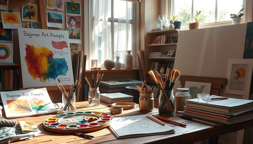
I’ve had this happen more times than I can count, I type a prompt, hit generate, and the result is close, but not right. The pose is weird, the background steals the spotlight, or the style drifts into something I didn’t ask for.
The good news is that great AI Image Prompts aren’t magic words. They’re clear instructions, in a predictable order, with just enough detail to guide the model and not enough clutter to confuse it.
In this post, I’ll share the core prompt parts I rely on, how I keep prompts clean, how I control style and composition, and a simple workflow I reuse so I can get better images fast.
The core ingredients of AI Image Prompts that actually work
The best prompts I write aren’t long and poetic. They read more like a short brief you’d hand to a photographer or illustrator.
My go-to formula looks like this:
Subject + setting + style + lighting + mood + camera/framing (optional)
Most of the time, I aim for 15 to 50 words, usually 1 to 2 sentences. Short prompts keep the model focused. Longer prompts can work, but only when each phrase adds a real visual constraint.
Here’s a quick before-and-after to show what changes the output.
Before (too loose):
“A fox in the snow, cinematic.”
After (structured):
“Red fox sitting in fresh snow in a pine forest at sunrise, cinematic photo, soft golden-hour light, shallow depth of field, calm mood, close-up portrait.”
Same idea, totally different level of control.
Start with a clear subject and action
If I want the model to listen, I start by naming one main subject and what it’s doing. One subject first is my easiest fix for cluttered scenes, especially when I’m tempted to describe everything at once.
A few prompt patterns I use a lot:
- Portraits: “Freckled teen laughing, looking off-camera”
- Landscapes: “Storm clouds rolling over a desert highway”
- Product shots: “Ceramic mug with steam rising, on a wooden table”
Specific nouns beat vague ones almost every time. “Red fox” is stronger than “animal.” “Handmade ceramic mug” is stronger than “cup.” For action, I keep it simple: sitting, pouring, running, holding, reading. Clear verbs give the model a pose, not just a thing.
If you want more examples of how prompt wording affects quality, I like this practical overview from How-To Geek on prompt crafting, it matches what I see in daily use.
Add setting, time, and key details (but only the ones that matter)
Once the subject is set, I place it somewhere real. Setting and time are the “stage directions” that stop images from feeling generic.
I also add 2 to 4 key details that change the image the most, like materials, color, weather, props, or texture. The trick is picking details that steer the look, not decorating the prompt with random adjectives.
Helpful detail vs noisy detail:
- Helpful: “brushed metal,” “foggy forest,” “wet asphalt,” “worn leather”
- Noisy: “beautiful, stunning, amazing, highly impressive, magical, incredible”
Here’s a mini checklist I run through before I hit generate:
Quick scene checklist
- Where is it happening (forest, studio, street, kitchen)?
- What time is it (sunrise, noon, night)?
- What’s the one standout material or texture (glass, denim, marble)?
- What’s the one standout color (teal, warm orange, monochrome)?
- What’s the one prop that supports the story (book, lantern, skateboard)?
If I feel tempted to add 12 details, I cut it down. I’d rather get a clean first render and iterate than drown the model in mixed signals.
Control the look: style, lighting, and composition that shape the final image
In January 2026, most text-to-image tools are strong enough that the biggest difference isn’t “model quality,” it’s whether I’ve clearly chosen the look. Style, lighting, and composition are the steering wheel.
If you want a good reference on prompt structure from a tool maker’s perspective, Runway’s text-to-image prompting tips are worth skimming. I use similar building blocks even when I’m not using Runway.
Pick one style and one mood so the model does not get confused
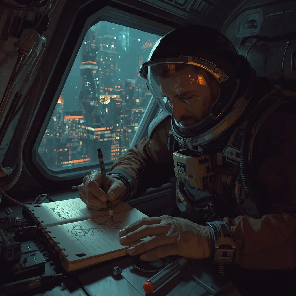
Prompt: A digital painting depicting a medium close-up of a weary but resolute astronaut sketching in a notebook with a physical pencil. The notebook has the words ‘MISSION LOG: EXODUS’ written clearly on the cover in a bold, sans-serif font. The astronaut is positioned in a cramped, minimalist spaceship cockpit filled with glowing wires and exposed circuit boards. Outside the reinforced glass window behind them, the hazy neon lights of a sprawling cyberpunk megacity glow through the darkness. The lighting is dominated by heavy shadows, with sharp highlights reflecting off the astronaut’s visor and the metallic edges of the desk. The atmosphere is thick with a sense of isolation and purpose.
My rule: one main style, one mood, then maybe a small extra flavor phrase.
Common style anchors:
- “realistic photo”
- “watercolor illustration”
- “3D render”
- “anime-style illustration”
- “flat vector”
Clashing styles are a common reason prompts “almost” work. Two quick examples:
Clashing: “macro photo, watercolor, 3D render, anime style”
Cleaned up: “macro photo, soft studio lighting, shallow depth of field”
Clashing: “oil painting, pixel art, documentary photo”
Cleaned up: “oil painting, painterly brushstrokes, muted earth tones”
Mood words are small, but they change a lot: palette, contrast, expression, and atmosphere. I keep a short set I reuse: cozy, eerie, joyful, tense, peaceful, epic. If I pick “cozy,” I expect warmer tones and softer contrast. If I pick “eerie,” I expect colder tones and deeper shadows.
Use lighting and camera words to get more realistic, polished images
Lighting is the fastest way I know to improve results without rewriting the whole prompt. These phrases tend to produce reliable shifts:
Lighting phrases I use often: golden hour, soft window light, studio lighting, neon night, backlight, overcast daylight.
Camera and framing words help most when I want photo-like images or cleaner composition:
Framing and camera cues: close-up portrait, wide shot, eye-level, low angle, aerial view, 35mm, 50mm, macro, shallow depth of field, rule of thirds.
When I’m doing portraits, “close-up portrait, 50mm, shallow depth of field” often cleans up the background and pushes attention to the face. For environments, “wide shot, eye-level” can stop the model from zooming into random details. For products, “studio lighting, macro, clean background” usually gets me closer to a catalog look.
A simple workflow for better results every time (and the mistakes I avoid)
I treat prompting like tuning a recipe. I don’t throw out the whole dish because it needs salt.
My repeatable workflow:
- Draft the prompt using the formula.
- Generate once.
- Diagnose the biggest issue.
- Edit only 1 to 2 parts.
- Generate again.
Here’s my quick troubleshooting map:
If faces look off: I simplify the subject, add portrait cues (close-up, eye-level), and reduce background detail.
If the background is messy: I cut extra props, pick one setting detail, add a composition cue (wide shot, rule of thirds).
If the style drifts: I reuse a saved “style block” word-for-word and stop mixing style terms.
If the crop feels wrong: I change aspect ratio to match the goal (square for avatars, wide for scenes).
If artifacts show up: I add negative prompts when the tool supports them.
For extra beginner-friendly prompt habits (especially if you use Midjourney or Stable Diffusion), I’ve also found PromptBuilder’s tips for prompts to be a solid checklist.
Iterate like a pro: change one thing, keep the rest the same
When I change everything at once, I learn nothing. When I change one variable, I start to see cause and effect.
A mini example, using the same base prompt and changing one piece:
Base: “Portrait of a chef plating pasta in a small kitchen, realistic photo, calm mood.”
- Change only lighting: “…soft window light, warm tones”
- Change only camera: “…50mm lens, shallow depth of field”
- Change only mood: “…tense mood, high contrast shadows”
That’s it. Small edits, big clarity.
I also save reusable blocks for consistency, especially for series work:
- Character block: age, hair, outfit, defining features
- Style block: “realistic photo” or “watercolor illustration” plus a short descriptor
- Lighting block: one lighting phrase I keep consistent across a set
Common prompt problems and quick fixes (vague, overloaded, wrong format)
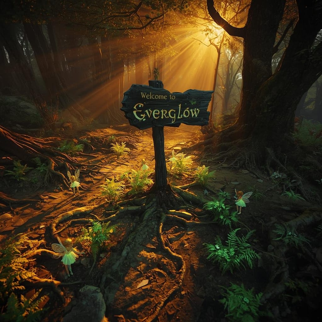
Prompt: A wide-angle view of a magical forest floor where towering mushrooms with translucent, bioluminescent caps glow in shades of neon cyan and amethyst. Tiny, delicate fairies with gossamer wings like dragonflies hover near the glowing fungi, their trails leaving faint sparkles in the air. The background features ancient, gnarled trees covered in thick emerald moss and hanging vines. Rays of golden sunlight pierce through the dense leafy canopy in thick volumetric beams, illuminating the floating dust motes and mist. The art style is a richly detailed fantasy illustration with a focus on painterly textures and vibrant, contrasting colors.
These are the issues I see most, and how I fix them fast:
Too vague: “A cool city at night.”
Fix: name the subject and one anchor detail (neon alley, rainy street, street market, skyline).
Overloaded: long strings of adjectives and mixed ideas.
Fix: cut it to one subject, one setting, one style, one lighting cue.
Mixed styles: asking for “photo + watercolor + anime” in the same breath.
Fix: pick the one you want most, then commit.
Forgetting what I don’t want: text overlays, watermarks, extra limbs.
Fix: add negative prompts when supported, like no text, no watermark, no extra limbs, no blur, no low resolution.
Conclusion
When my AI Image Prompts work best, they’re clear, structured, and easy to tweak. I stick to one simple line: subject + setting + style + lighting + mood + (camera/framing), then I iterate with small changes until the image locks in.
Try the template today, save one style block you love, and run three quick variations by changing only lighting, camera, or mood. You’ll get more consistent images, and you’ll actually understand why they improved.
FAQ Section
What are the essential components of an effective AI image prompt?
Effective AI image prompts typically include a clear subject, desired action/context, specific style, composition/shot type, lighting details, and additional descriptive elements, all arranged in a logical sequence.
How can I prevent AI from misinterpreting my prompt’s style or composition?
To prevent misinterpretations, be highly specific with style keywords (e.g., ‘photorealistic’ vs. ‘oil painting’), use negative prompts to exclude unwanted elements, and experiment with prompt weighting if your AI model supports it to emphasize certain aspects.
Is there a universal workflow for getting better AI images faster?
While not strictly universal, a highly effective workflow involves starting with a simple core prompt, iteratively adding details, using negative prompts for refinement, and analyzing minor variations to learn what works best for your desired output.
Why do my AI image prompts often produce results that are ‘almost’ right but not perfect?
This usually stems from ambiguity, insufficient detail in key areas (like lighting or camera angle), an overabundance of confusing information, or not clearly specifying what not to include (negative prompting).