
5 Best Free AI Tailwind CSS Generators to Boost Your Workflow (2026)
Imagine cutting your front-end development time in half simply by describing the UI you want. With the rapid rise of the AI Tailwind CSS generator, converting text prompts into production-ready utility classes is no longer a futuristic dream, it’s quickly becoming a normal way to build.
An AI Tailwind CSS generator takes plain English (or a sketch-level description) and returns Tailwind utility classes, usually wrapped in HTML or JSX. In this guide, you’ll get five free tools you can try in March 2026 (with honest “free tier” limits), plus a practical way to prompt, validate, refactor, and ship the output without regret.
What an AI Tailwind CSS generator is, and why Tailwind works so well with it
At its core, an AI Tailwind CSS generator is a translator. You describe a component like “pricing card with two tiers, highlighted middle plan, responsive stack on mobile,” and it outputs markup with Tailwind classes that match that intent.
Tailwind is a great match for this because its API is made of small, predictable building blocks. Utilities like p-6, rounded-xl, md:grid-cols-3, and hover:bg-slate-900 follow a pattern. That pattern is easier for a model to reproduce than hand-authored CSS that depends on naming conventions, file structure, and cascade behavior.
In practice, these tools tend to generate the same kinds of UI over and over, because those are the common needs in real projects: cards, navbars, signup forms, hero sections, feature grids, settings panels, and simple dashboards. That’s good news, because those are also the parts that can eat hours when you’re moving fast.
If you want a broader view of how AI UI generators compare (not Tailwind-only), Komposo’s roundup is a helpful reference: AI UI generator comparison for 2026.
How the prompt turns into production-ready utility classes
Most tools follow a simple pipeline:
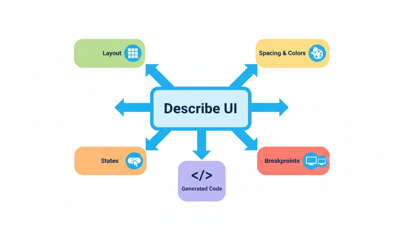
You describe layout, spacing, color intent, states, and breakpoints. The generator returns HTML or JSX with Tailwind classes. Then you paste it into your app, run it, and adjust.
The phrase “production-ready” should mean more than “it renders.” Aim for output that has:
- Mobile-first responsive behavior (clear
sm,md,lgchanges) - Accessible basics (labels, button types, focus states, sensible heading order)
- Readable structure (not a div soup with 20 wrappers)
- No random class noise (utilities that don’t affect layout or visuals)
If the tool gets you 70 percent there, that’s still a win. Your job is to make the last 30 percent consistent with your codebase.
When AI saves time, and when it slows you down
AI shines when you need solid boilerplate fast. It’s great for MVP screens, layout variations, and getting unstuck when your brain is fried at 11 p.m.
However, it can slow you down when your app has strict design tokens, a tight component API, or complex interactions. You can spend longer fighting output than writing it yourself.
Use AI when these are true: you can accept “pretty close,” you need several variations, or you’re exploring layout options quickly. Hand-code when these are true: you must match an existing design system exactly, the component needs advanced state logic, or your team requires a strict DOM structure for testing and reuse.
Treat AI output like a rough cut. You still edit before it hits the main branch.
The 5 best free AI Tailwind CSS generators you can use right now
Free usually means limits. You might get fewer generations, fewer templates, fewer exports, or less control over framework output. Still, a good free tier can cover a lot of day-to-day UI work.

Workik AI, best all-around helper for responsive layouts and dark mode
Workik’s Tailwind generator is a strong “start here” option when you want usable markup quickly. It’s especially helpful for responsive grids, common sections (hero, features, pricing), and dark mode-friendly styling that doesn’t look like an afterthought.
What you get for free: access to the AI-powered Tailwind generator with a web workflow that’s simple to test and iterate.
Strongest feature: practical, web-app-ready layouts that include responsive classes and sensible spacing.
Main limitation: free access may have usage or advanced feature limits depending on time and account tier.
Try it if you want a quick path from prompt to code and you plan to paste into React or Next.js: Workik Tailwind CSS code generator.
TailwindGenAI, fastest text-to-code for common components
TailwindGenAI-style tools focus on speed. You write “login form with social buttons, error state, disabled submit, responsive two-column layout on desktop,” and you get a component you can tweak.
What it’s best for: common components you build over and over (forms, cards, navbars).
What you get for free: a limited number of generations (often token-based or request-based).
Strongest feature: quick iterations and “give me three variants” prompts.
Main limitation: output can drift from your design tokens unless you specify them.
Try it if you want fast scaffolding and you’re comfortable refactoring the last mile.
Windframe, best when you want a visual builder plus AI
Some people think in text. Others need to see spacing and hierarchy. Windframe wins when you want both: AI generation plus a visual editor where you can drag, tweak, and then export.
What it’s best for: landing pages, dashboards, and multi-section layouts that benefit from visual adjustment.
What you get for free: a usable editor and a starter set of templates, with premium features and broader libraries reserved for paid tiers.
Strongest feature: export options to popular formats like React and HTML, after you visually refine the design.
Main limitation: you still must review semantics and trim wrappers after export.
Try it if you want AI speed without guessing what the spacing will look like: Windframe Tailwind visual builder.

Tailwind Generator, best for quick visual editing without guesswork
“Tailwind Generator” tools tend to be more predictable than pure text generators. Instead of asking for a perfect prompt, you often adjust controls, preview the component, and export the class list and markup.
What it’s best for: small UI bits like buttons, badges, simple cards, and spacing experiments.
What you get for free: basic component editing and export, depending on the specific site and tier.
Strongest feature: predictable output because you can see changes live.
Main limitation: less “smart” about app structure, accessibility, and component APIs.
Try it if prompts feel too fuzzy and you’d rather steer visually.
Google Stitch, best for exploring UI ideas with React and Tailwind support
Google Stitch (from Google Labs) is an idea-to-layout assistant. It’s strong when you’re exploring directions, not polishing a final design system.
What it’s best for: early UI exploration, quick iterations, and testing layout ideas before you commit.
What you get for free: experimental access to generate UI concepts and code outputs (availability and features can change).
Strongest feature: quick “show me another version” loops that help you pick a direction.
Main limitation: you must align output with your Tailwind config, component patterns, and accessibility rules before shipping.
Try it if you want to explore fast, then rebuild cleanly inside your app.
How to get clean, reusable Tailwind code from any generator
The tools matter, but your workflow matters more. The difference between “AI saved me hours” and “AI made a mess” comes down to three habits: prompt structure, verification, and refactoring.
Start by treating the generated markup as a draft. Then make it match your team’s conventions. Keep class names consistent with your Tailwind config, prefer scale-based spacing, and avoid arbitrary values unless you truly need them.
A prompt template that keeps results consistent
Use a fill-in prompt pattern like this (copy it into your notes and reuse it):
Goal: [what you’re building, for who, and where it appears]
Output: [HTML or React component, no extra explanation]
Layout: [flex or grid, columns/rows, alignment]
Spacing scale: [use Tailwind spacing scale, avoid arbitrary values]
Colors: [use my tokens, ex: slate/indigo, no custom hex]
Typography: [sizes for title, body, meta text]
States: [hover, focus-visible ring, active, disabled, error]
Responsive: [mobile-first, changes at sm/md/lg]
Dark mode: [use dark: variants, keep contrast high]
Accessibility: [labels, aria where needed, proper button types]
This format forces the model to make fewer guesses. It also makes your results easier to compare across tools.
Ask for responsive behavior and dark mode the right way
For responsive behavior, don’t say “responsive.” Say what changes and when. Example: “On mobile, stack cards. At md, use 3 columns. Keep buttons full-width on mobile, auto width at md.”
For dark mode, specify your strategy. If your project uses class-based dark mode, ask for dark: variants and request contrast that stays readable. Also ask for focus styles that work in both themes.
A few responsive needs worth calling out often: navbar collapses, cards stack then grid, forms switch from single column to two columns, and long labels wrap without breaking layout.
Audit and refactor before you commit the code
Before you commit, do a quick audit. Remove duplicate utilities, trim wrappers, and make class lists readable. If the generator sprayed arbitrary values everywhere, replace them with your spacing scale.
Also check basics you’ll notice later in QA: keyboard focus rings, heading order, form labels, and error messaging space. Finally, keep an eye on version fit. Tailwind updates can change defaults and recommended patterns, so validate output against your current Tailwind setup.
If you want an extra “convert and compare” option for checking AI output against another generator, this is a handy reference point: design-to-Tailwind converter.
Ship it in React and Next.js without creating a maintenance mess
Generated markup is usually a one-off. Your app needs components.
Convert the output into a component with clear props, then extract repeated patterns into shared building blocks. If the tool outputs JSX, that helps, but it doesn’t solve component design for you.

Turn one-off markup into components with props and variants
Pick a base component boundary, then add variants. For example, a Button can accept intent (primary, secondary, danger) and size (sm, md, lg). Keep a className escape hatch, but don’t rely on it for core styling.
When you see the same class cluster three times, extract it. That’s how you stop “AI paste” from becoming your codebase style.
Avoid common Tailwind problems in apps (dynamic classes, duplication, and bloat)
Be careful with string-built class names. If you generate class names at runtime from user input, you can break build-time class detection in some setups. Also watch duplication. Long class strings repeated across files make reviews harder and bugs more likely.
Instead, keep class order consistent, extract shared patterns, and put tokens in your Tailwind config so you don’t retype them in every prompt.
FAQ (Readers Questions)
Are AI Tailwind generators safe to use for production?
Yes, if you treat output as a draft and review it. Check accessibility, responsive behavior, and consistency with your design tokens before merging.
Will an AI Tailwind CSS generator replace learning Tailwind?
It won’t. The best results come from knowing Tailwind well enough to spot bad spacing, missing states, and fragile layouts. Think of AI as a fast assistant, not a substitute.
Why does the generated HTML sometimes feel “heavy”?
Many generators add extra wrappers to guarantee alignment. You can usually remove one or two layers without changing layout. After that, extract repeated sections into components.
What if I don’t want Tailwind at all?
That’s valid. If you’re comparing approaches, this roundup can help you evaluate other options: Tailwind CSS alternatives in 2026.

Conclusion
Workik AI is the most practical all-around pick for responsive sections, Windframe is best when a visual editor helps you refine, TailwindGenAI fits rapid component drafts, Tailwind Generator works when you want predictable visual tweaks, and Google Stitch is great for fast UI exploration.
The payoff is simple: less boilerplate and faster UI iteration, as long as you review and refactor before shipping. Pick one tool today, try the prompt template on a real component (a navbar, pricing card, or signup form), then save your best prompts so you can reuse them on your next project. If you want more workflows like this, subscribe to a developer newsletter and keep a swipe file of prompts that actually ship.
Leave a Reply