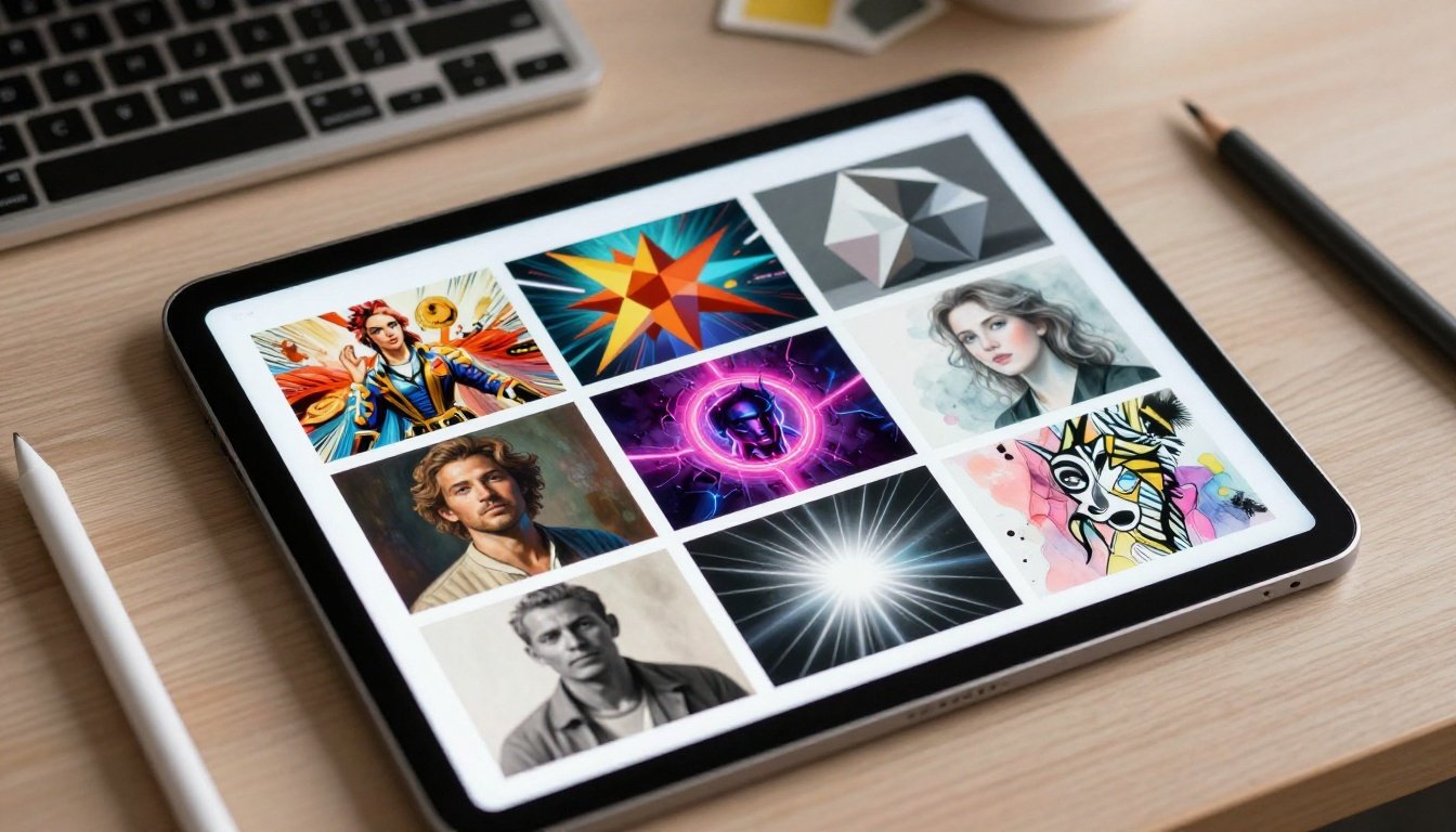
MidJourney can turn one simple prompt into a velvet-soft painting, a comic-book blast of color, or a broken screen full of static. That jump in look is why image style matters so much.
If your results feel flat, the problem often isn’t the subject. It’s the visual language wrapped around it. These 10 MidJourney styles keep showing up because they’re clear, dramatic, and easy to guide with a few strong words.
What makes a MidJourney image style stand out?
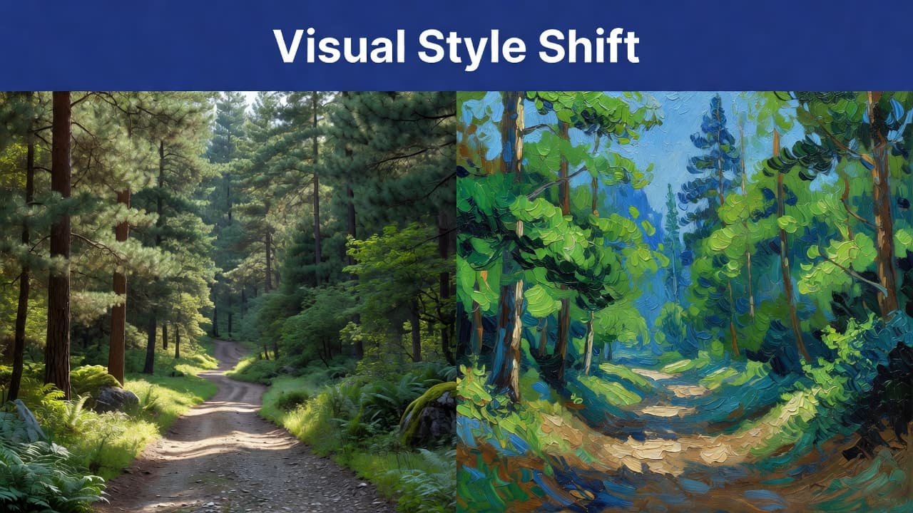
A style changes more than surface detail. It changes texture, color, rhythm, and mood, all at once. In MidJourney, that means the same portrait can feel elegant, chaotic, nostalgic, or eerie, depending on the style words you choose.
### Style, subject, and mood are not the same thing
The subject is what the image shows. A portrait, a skyline, or a fox in snow are subjects. Style is how that subject looks, whether it’s Cubist, Pop Art, or Gouache. Mood is the feeling it gives off, such as calm, electric, or unsettling.
That difference matters because MidJourney reads all three. “A portrait” is only a starting point. “A portrait in Pop Art with hot pink shadows and upbeat mood” points the model toward something far more distinct.
Why some styles work better than others in MidJourney
The strongest styles are easy to recognize at a glance. They have bold features, clear color behavior, and textures MidJourney can echo well. That’s why Pointillism, Impressionism, and Glitch Art keep appearing in prompt communities and shared examples, including these community style examples.
Also, some styles fit certain subjects better. Cubism loves faces and architecture. Impressionism flatters gardens and street scenes. Meanwhile, Glitch Art shines when you want tech-heavy tension instead of natural beauty.
The 10 image styles people keep coming back to in MidJourney
Some 2026 trends lean toward hybrid hand-painted work, psychedelic neon, and gritty neo-brutalist edges. Still, these 10 styles stay popular because they produce memorable results fast and give prompts a clear visual spine.
Pointillism for images that feel made of tiny dots
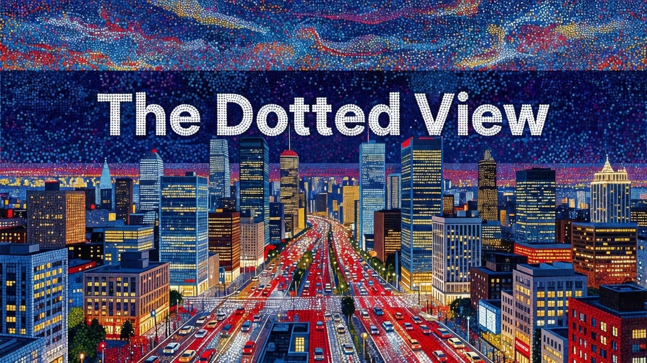
Pointillism looks hand-built, almost patient. Up close, it seems scattered into dots. From a distance, those dots melt into glowing color. It works best for cityscapes, bright birds, flower fields, and portraits that need a painterly pulse.
### Cubism for bold shapes and fractured faces
Cubism breaks a scene into sharp planes and tilted geometry. Faces look split and reassembled. Tables, windows, and buildings become stacks of angles. Use it for portraits, still life, and interiors when you want tension, structure, and visual bite.
Pop Art for loud color and comic-book energy
Pop Art is blunt in the best way. It uses flat color, thick contrast, halftone dots, and poster-like confidence. MidJourney handles it well for celebrity portraits, fashion images, product ads, and graphics that need to stop the scroll.
Psychedelic for swirling color and dreamlike motion
Psychedelic style twists the frame into a visual current. Shapes ripple, colors pulse, and edges feel slightly alive. It suits fantasy forests, music posters, cosmic scenes, and surreal portraits. In 2026, psychedelic neon remains one of the most reused looks across AI art communities.
Impressionism for soft brushstrokes and glowing light
Impressionism cares more about atmosphere than razor detail. Light blooms across the scene, edges soften, and color blends like wet paint. Use it for gardens, rainy streets, sunsets, and quiet portraits where you want warmth instead of sharp precision.
Fauvism for wild color that bends reality
Fauvism throws realism out the window and keeps emotion. Trees can glow orange, skin can turn teal, and shadows can hum with violet. Because the brushwork stays visible, MidJourney images feel expressive rather than polished. Landscapes and animal art often look fantastic in this style.
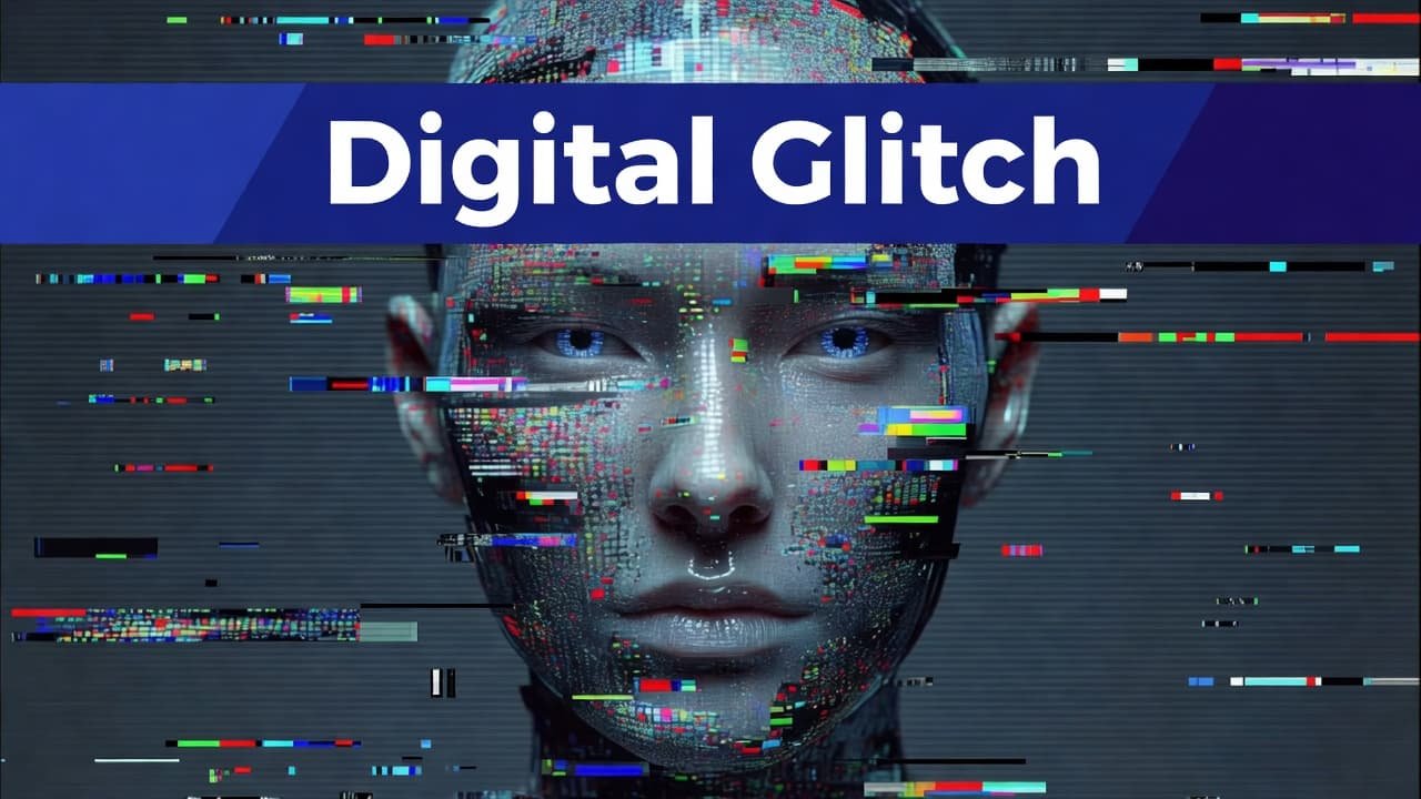
Glitch Art for a digital, broken-screen look
Glitch Art introduces failure on purpose. You get pixel drift, RGB splits, scan errors, and visual noise that feels electronic and unstable. It fits cyberpunk scenes, futuristic portraits, album covers, and brand visuals that want an edgy tech mood.
### 80s VHS Color Glitch for retro video nostalgia
This version of glitch art feels older and warmer. Tape noise, color bleed, scan lines, and blown-out magentas create that late-night TV mood. It’s a natural fit for synthwave scenes, retro portraits, arcade posters, and nostalgic music artwork.
Deformed Troxler Effect for warped, unsettling visuals
This style pulls from optical distortion. Faces blur at the edges, features stretch, and objects seem to drift as if your eyes can’t lock onto them. Because it feels eerie, it works best for experimental portraits, horror art, and strange editorial concepts.
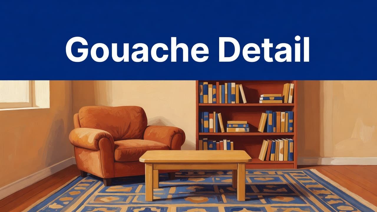
Modern Gouache Texture for soft, rich, painted detail
Modern gouache has matte depth and thick painted warmth. MidJourney often renders it with soft edges, layered brush texture, and cozy color. That makes it great for storybook scenes, editorial spots, food art, children’s themes, and gentle home interiors.
## How to write better MidJourney prompts for each style
A strong style word helps, but it won’t carry the whole image alone. MidJourney responds better when you pair style with a clear subject, color direction, and texture cue.
Use subject, color, and texture together
A style name works best when it has something concrete to grab onto. “Pointillism” is okay. “Pointillist blue jay on a fence, jewel-tone dots, spring light” is far better.
Try prompts like “cubist jazz singer, fractured planes, smoky brown palette”; “pop art perfume bottle, halftone texture, yellow and red”; “modern gouache breakfast table, matte paint, warm morning light”; and “fauvist tiger in tall grass, electric orange and teal.”
One clear style word beats five vague adjectives.
Keep prompts short enough to stay focused
Too many details blur the result. MidJourney often gives cleaner images when the prompt stays tight and visual. As of 2026, MidJourney V8.1 also gives stronger direct control through Raw mode, so “–style raw” can help when the model keeps drifting into its default polish.
Try “glitch art portrait, RGB shift, black background, –style raw”; “impressionist harbor at sunrise, soft brushwork, pale gold”; “psychedelic desert poster, swirling sky, neon shadows”; and “80s VHS glitch dancer, scan lines, magenta bleed.” If you want repeatable style control, Midlibrary’s style reference library is useful for checking SREF options and examples.
Match the style to the scene you want
The smartest prompt is not the longest one. It’s the one that matches the job. Pop Art fits social graphics because it reads fast. Impressionism fits beauty and travel scenes because it softens everything. Glitch Art fits tech branding because the distortion feels intentional.
Use prompts such as “pointillist Paris street after rain, colorful dots”; “deformed Troxler face, blurred features, eerie studio light”; “pop art sneaker ad, flat shadows, cyan and orange”; and “modern gouache children’s bedroom, cozy lamps, muted coral.” You can see more variations in this MidJourney style roundup, then trim the ideas down into your own shorter prompt.
Which style should you try first?
Start with your goal, not your favorite art movement. A good style choice makes the image feel right before you even notice the subject.
Best styles for portraits and faces
Pop Art gives faces instant personality and graphic punch. Cubism adds structure and tension. Glitch Art makes portraits feel synthetic or futuristic. Deformed Troxler Effect pushes faces into eerie, unstable territory, which works best for experimental work.
Best styles for landscapes and scenery
Impressionism is the gentlest pick for scenery because light carries the image. Fauvism adds emotional color fast. Pointillism makes wide scenes shimmer, while Psychedelic style turns forests, deserts, and skies into moving dreamspaces.
Best styles for social content and branding
Pop Art grabs attention in thumbnails and banners because contrast stays loud even at small sizes. VHS Color Glitch gives retro identity to posters and album covers. Modern gouache adds warmth for editorial posts, product stories, and cozy lifestyle branding.
Final thoughts
The best MidJourney style is the one that matches the feeling you want on the screen. A fox can look tender in gouache, electric in Pop Art, or haunted in Glitch Art, all from the same basic idea.
These 10 styles give you a strong place to start. Try the same subject in three different looks, compare the mood, and build your own visual voice one prompt at a time.
FAQ
Does MidJourney understand art movement names well?
Yes, usually. Well-known style names like Impressionism, Cubism, and Pop Art are easy for MidJourney to interpret because they have strong visual traits.
Should you use artist names or style names?
Style names are the safer starting point. They keep the prompt clear, and they avoid overloading the image with too many mixed signals.
What’s the difference between Glitch Art and VHS Color Glitch?
Glitch Art feels digital and sharp, with pixel shifts and broken-screen energy. VHS Color Glitch feels analog and nostalgic, with tape noise, scan lines, and color bleed.
Can you combine two styles in one prompt?
Yes, but keep the mix controlled. “Pop Art portrait with glitch accents” usually works better than stacking four or five styles into one sentence.
Leave a Reply